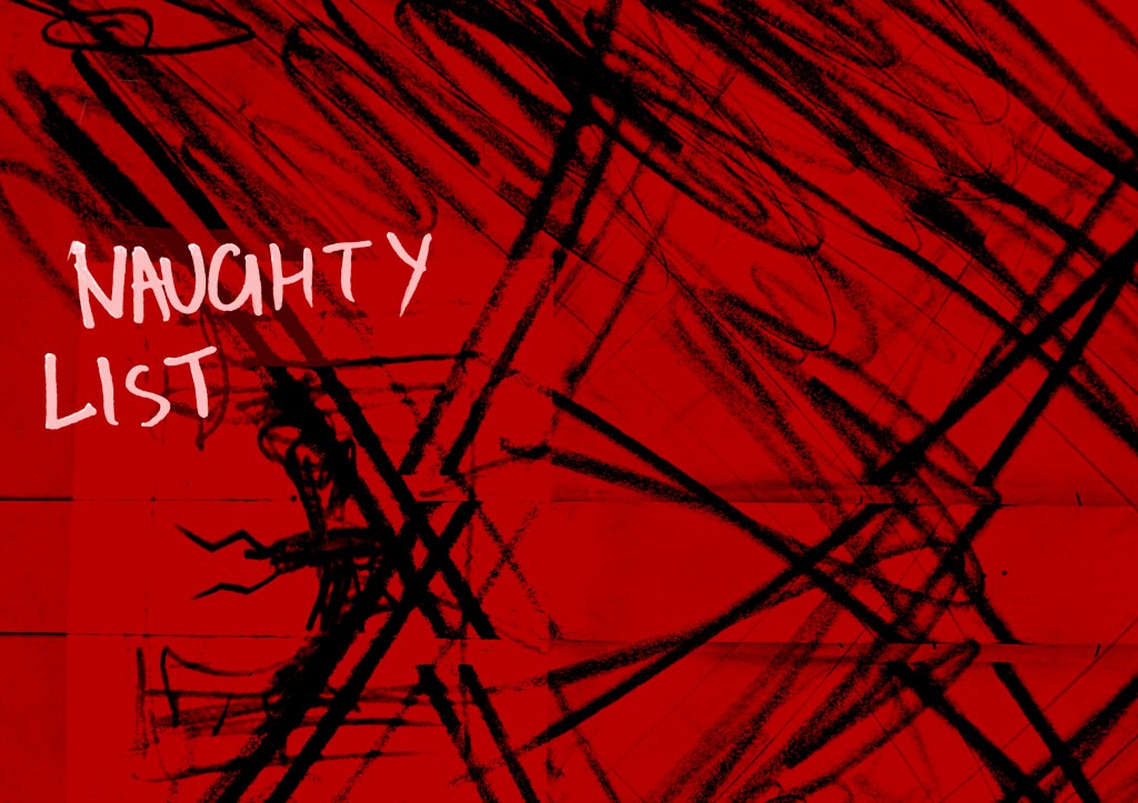
I thought nothing, if not “har har”, when I wrote “NAUGHTY LIST” in response to the text. I’ve thrown it on the front cover because I think it becomes clear quite quickly it’s about hell, but you get that juxtaposition of Santa and Christmas, which is quite fun, and sets a tone for a hell-based zine that’s not taking itself too seriously. Makes the reader work a little.
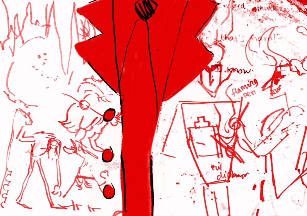
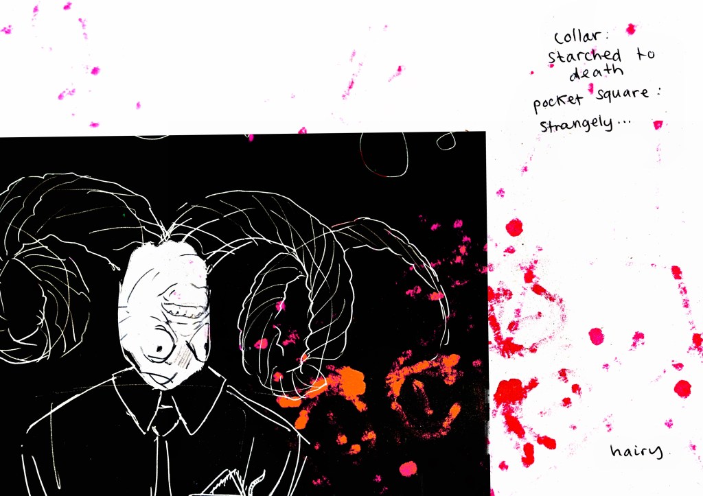
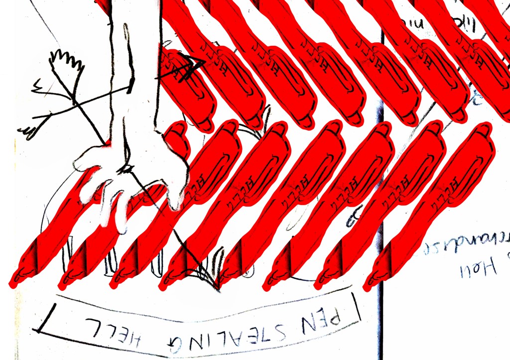
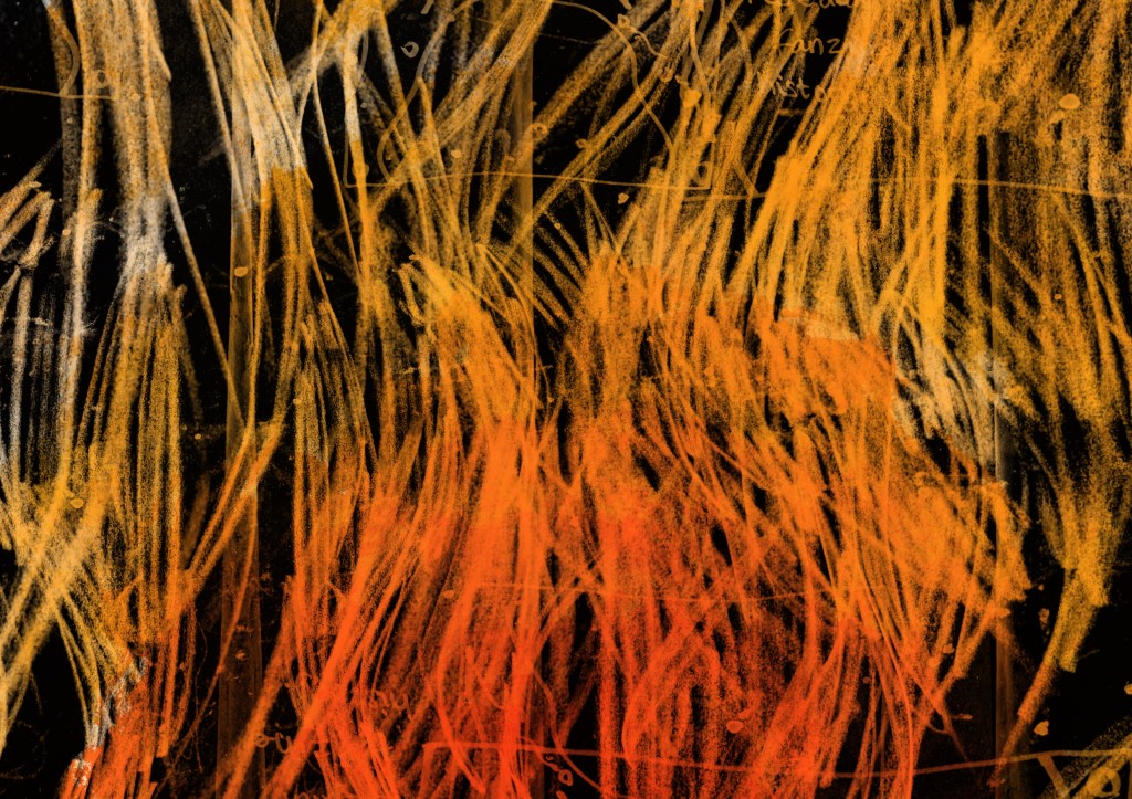
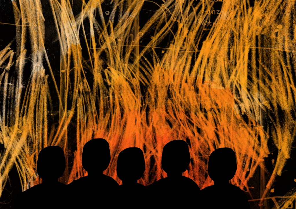
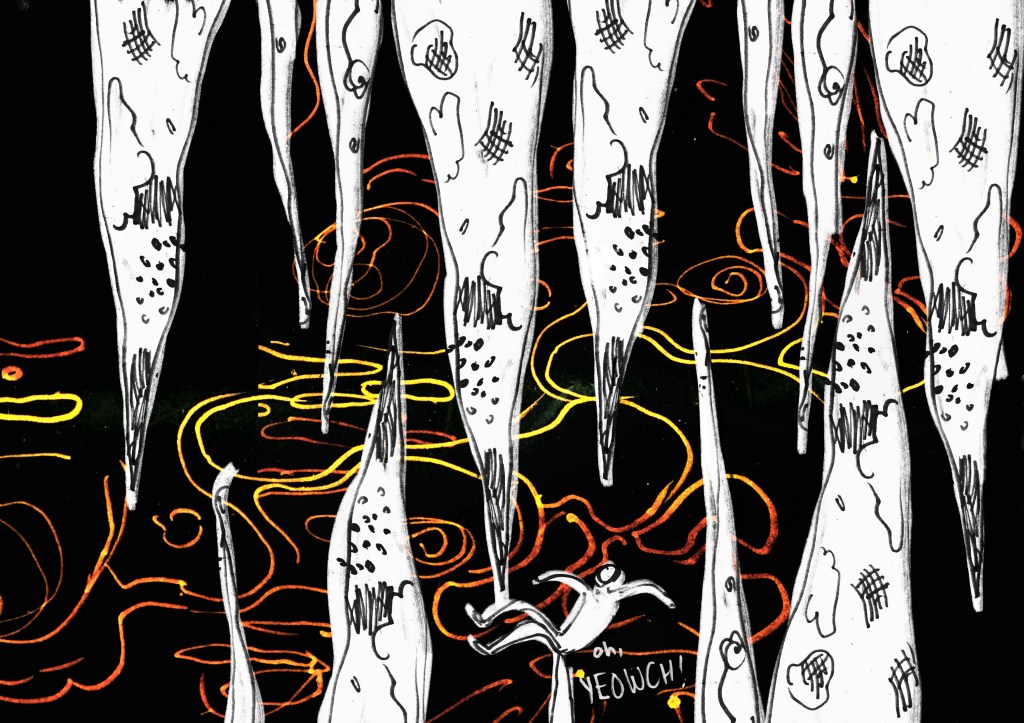
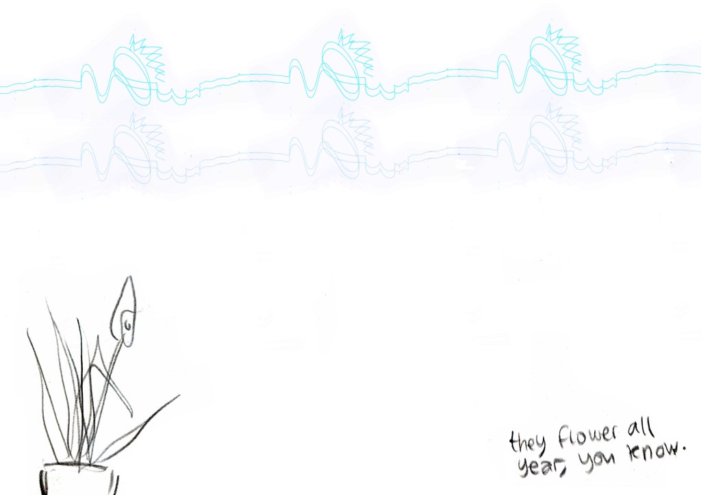
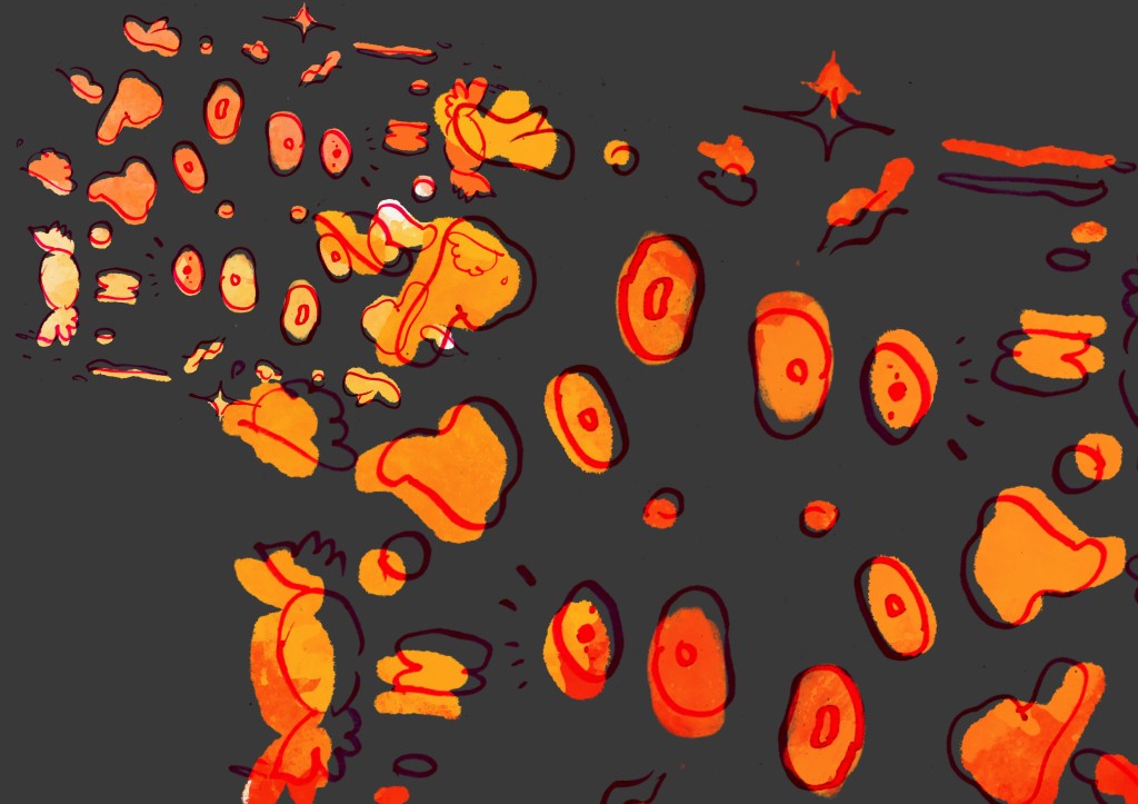
worked on the quite fun idea of patterning the demon’s suit with some of the penwork and drawings I’d made. Proud of the way I managed to get all the marks to interact with this one. This one, as with many of them, rely heavily on mistake and chance, which I like. The spatters are where marks have bled through another page of newsprint. The demon’s face was quite tightly drawn, but the erased face with a screaming one behind it is quite effective, I think. really into the atmosphere I created with this one. I’ve been trying to take an interest in patterning and repetition since observing far more of it than one would think in real life. I particularly noticed it at the Grand Hotel, in the architecture: even if you don’t register what the pattern is of, the repetition is pleasing at first glance. The hand breaking through the repetition and the anchoring of “PEN STEALING HELL” make this one successful, in my opinion.I decide in this moment that I prefer this image to the one above. The silhouetted heads respond more directly to the text, referring to the five terrified souls looking down on what Hell has to offer. The background was copy pasting my hellflame pencil texture a bunch, slapping them on multiply, inverting it, and colouring on a – probably a darken layer or something similar. I think the marker bleeds look like sparking embers. Actually quite fun and effective.I think they’ll never get me to relinquish text in my illustrations again. I’m surprisingly pleased with the background here – created similarly to the flame texture above. This is weird, but I get a real sense of depth with this one – like there really is three-dimensional space between the stalactites and mites. This was my favourite of a series of at least twenty marks trying to capture what a grating squeak on a metal chair would sound like. Again playing with patterning and colour, but I took the mark further below – as this page is visually pleasing, but didn’t really add to any narrative.Suddenly remembered the “two rows of fluorescent blue tube lights” along the office ceiling, and created a spread inspired by the cleanliness and whiteness of the office. I think a proficient demon with this mild interest in the plants – that’s a peace lily – enough so to mention this fact to the souls coming into the room – is a funny one. I also think that this laid against his complete apathy (or even enjoyment) of human suffering makes him even more terrifying and unpredictable. Hugely into this one, and this – again – was a child of mistake and inaccuracy. I focused in on phrases about the lava being like sweets, molten candy, molten sugar. I just think the tone and colour as well as the way the marker reacts organically with the colour and background make it really cool.
The next steps will be to consider whether the zine will benefit from spreads that are more half-and-half composed, or whether this sprawling, atmospheric thing I’ve had going is working really well for it. I’ve designed the spreads with a simple colour scheme in mind already, to keep things simple with myself – black, red, orange. Any images that have been a little too funky I’ve thrown through a gradient map that operates like the photocopier’s “two colour” print mode.
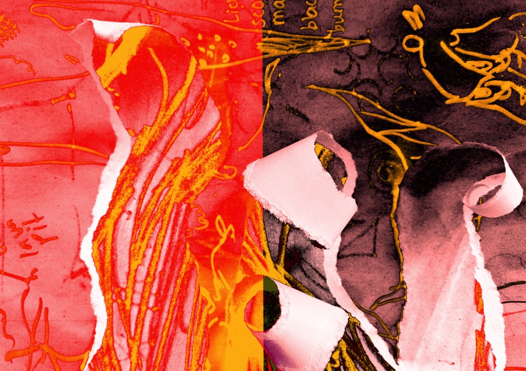
I printed out a bunch of pieces using the photocopier and will play with physically tearing and arranging, because I know how much I like using my hands and it always yields something unexpectedly fun.
Later edit: some more work, now based on photographs and torn paper!
I tore up some paper to look sort of like curling flames, and for tonal contrast put it against the black background of my sketchbook. Played with more composed ziney shapes – I do like some good frames and rectangles.
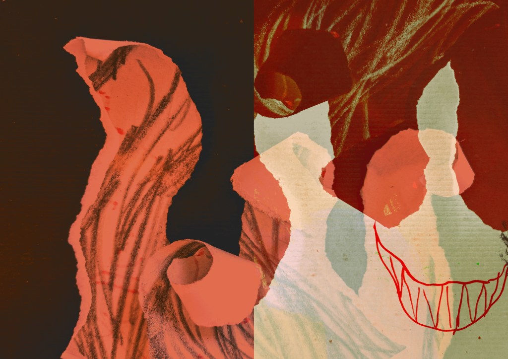
This spread was inspired by Jim’s composition on the screen. The full bleed laid against the nice, framed piece is interesting to me.Playing with layering effects that would look cool across the central fold of a zine. I see a face in the torn paper and the mouth.