I was sitting down to work on my zine – I’ve actually started referring to working in my head not as work, but as “Fucking around and finding out” – and I hopped onto Nieves.ch to take a look at some examples of good and interesting composition.
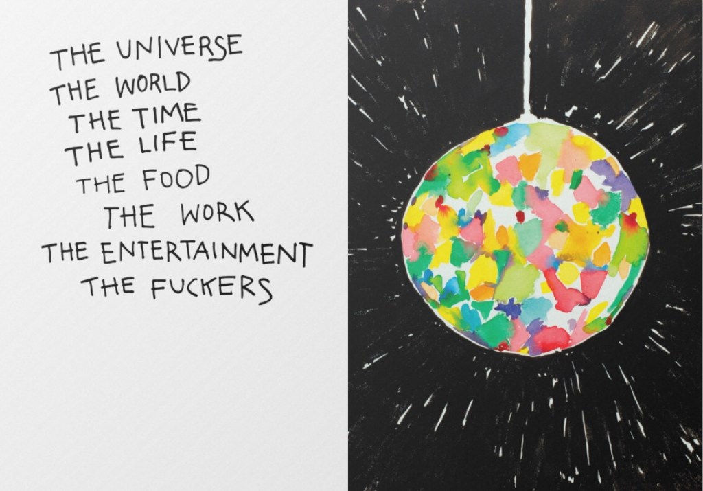
Look at the weighting on this… the circular frame of the disco ball, and the empty space at the bottom left. I could curl up in that negative space and take a nap while the disco ball spins.
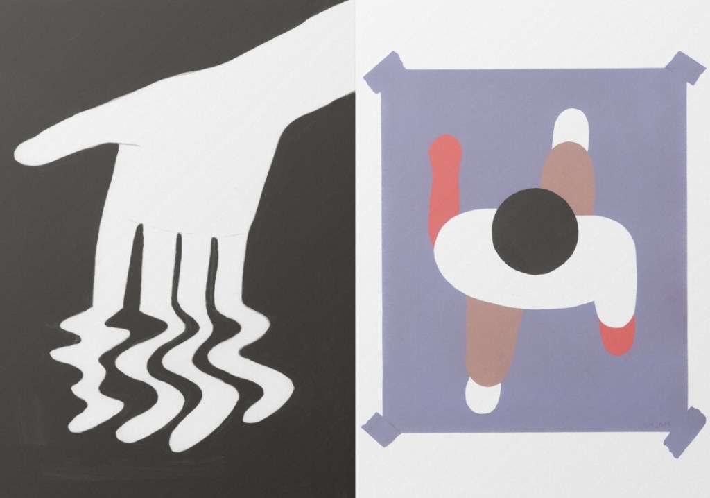
I could actually eat this spread. The way the white works, and the exact shade of desaturated lilac on the right – this sings to me.
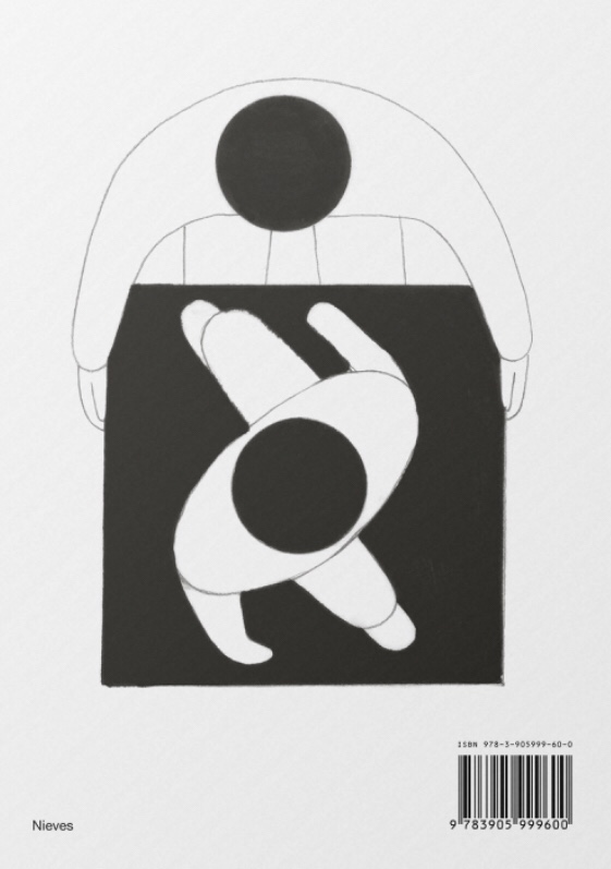
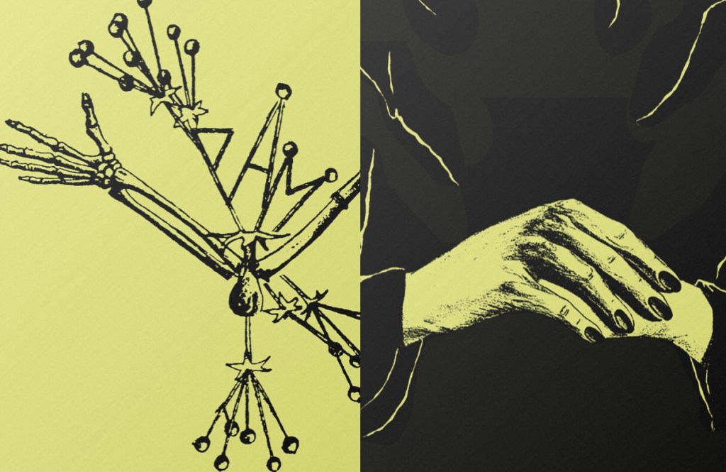
Look at the diagonals here! This artist was really interested in language and readability, and the figure here almost literally makes a letter X. Even the barcode adds to this page in my opinion.
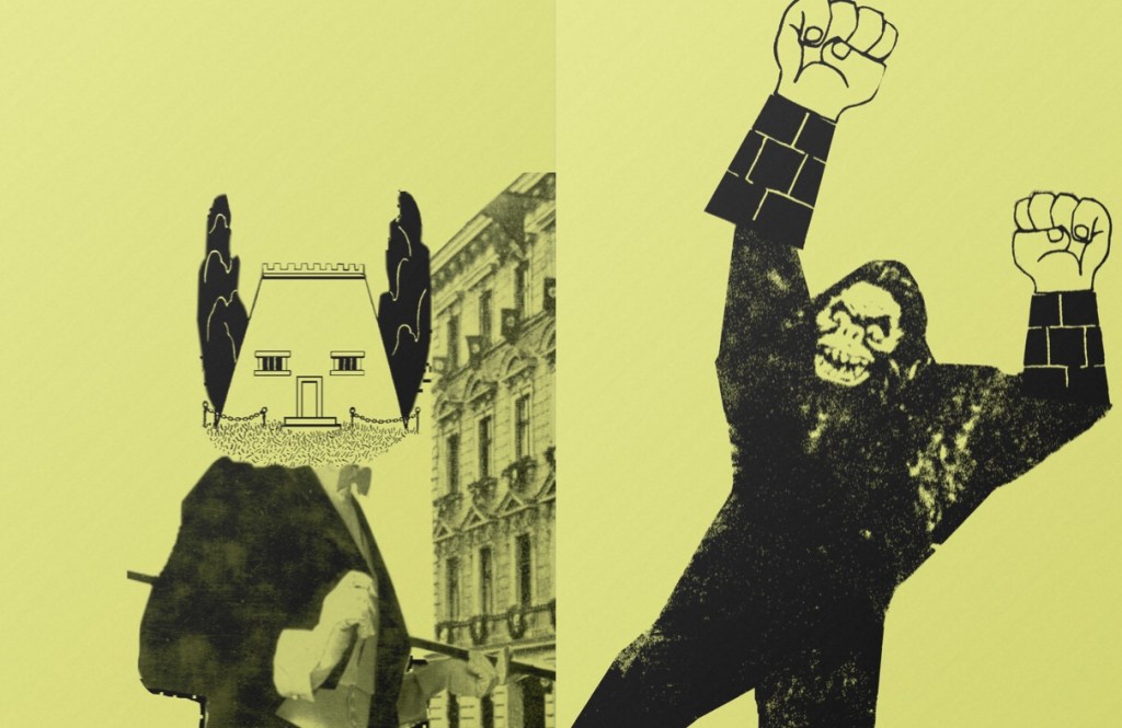
I keep coming back to this page! The gesture of the suited man so perfectly works with the offended, squinting house, but I didn’t even see it as a face the first time I saved this photo. The monkey makes a fantastic shape.
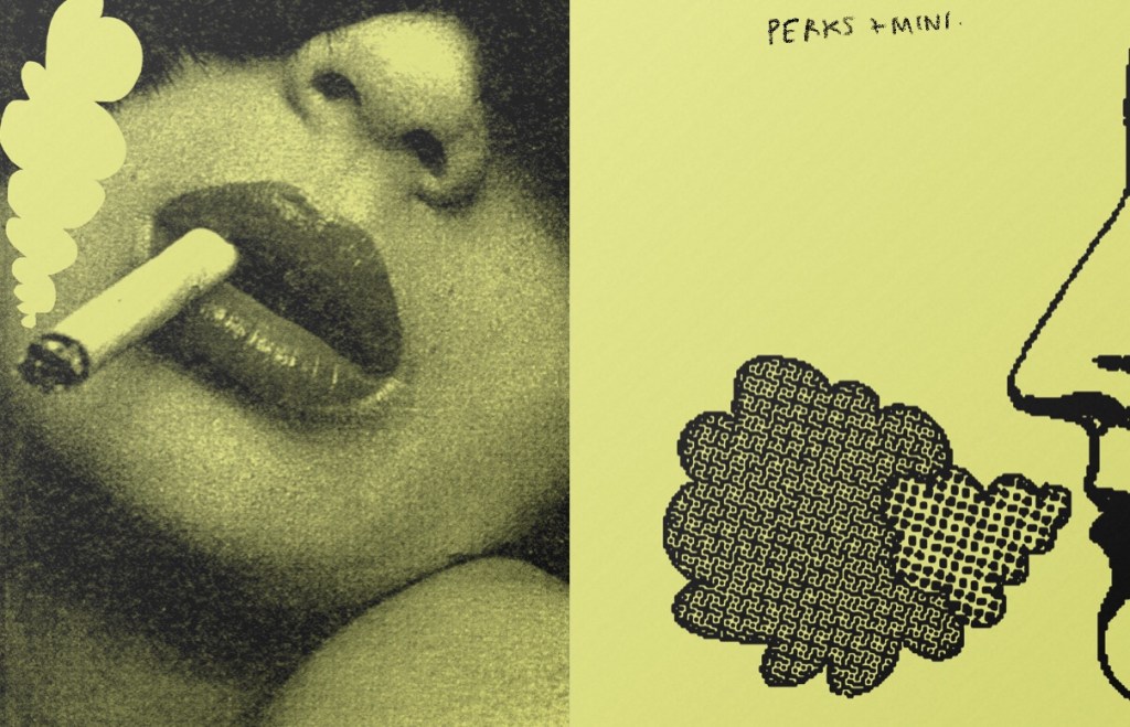
The smoke almost being pressed into the top left corner by the composition gives it a doodle-y, playful feeling to me.
I particularly liked Perks and Mini’s 100 page photocopied zine. What they manage to do, and on the yellow paper, has really interested me. The next zine I make, either for uni or personally, I’m considering in working with this black and white on colour paper style.
I am making pages upon pages for the zine, and hope to selectively choose the best looking ones and ones that work well together at the end. Right now it’s fucking around, and finding out.