In-universe, I’ve recently let myself think about the big Christmas Talent Show that the university is holding.
Mitzi is in the University Campus cafe/canteen when a group of seven or eight people sit down at a big table next to her. She eavesdrops and it becomes apparent that they’re this year’s Talent Show committee. She doesn’t recognise any of them – they are all theatre kids, and it shows.
She becomes quite endeared with the idea of a talent show. When she overhears them lamenting that they don’t have a poster and they need one quick sharp, she saunters over and offers to make one for them. They’re very grateful and she sits in on the rest of the meeting, getting details for the poster and checking specifications.
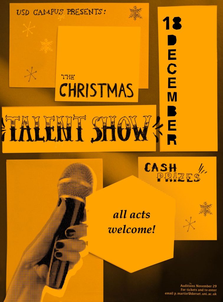
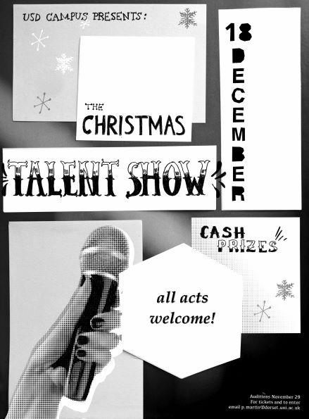
For the sake of keeping costs low, this poster has to be black-and-white, to be printed onto coloured paper. Below are the posters she makes – one mocked up with colour underneath, and one colour channel layer, so to speak, that she can throw under the photocopier and feed in the coloured paper.
Now, I’ll tell you a secret: I made this poster, not Mitzi. Since it’s what I’ve been thinking about, I thought making up one of the in-world posters would be a fun challenge, and keep me close to the characters.
My process was really fun for this little brief. I went in with no real ideas for what to do, but started traditional. I looked through magazines and found a cool full colour page of a blurred tennis court, which I kept, and a small stack of bricks from gardeners’ world that I thought could work really well for a structural base. Here’s what I mean.

Over the top of the tennis court image, I physically cut white paper into the blocks copying this pattern.
I took a photo of this and manipulated the rest of the image digitally, but my process was quite similar to traditional work: I used choppy selections to “cut out” the word DECEMBER to make it look hand made. I love eternally the Jonny Hana-esque handwritten type, especially Victorian woodcut lettering styles. The whitest blocks are edited in, and the darker blocks are the photographic paper texture showing underneath, giving the poster a sticky-note feel.
Finding a random image of a hand and mic, keeping the outline sharp but converting it to halftone, changing the curves and then putting it on a darken layer was fun. I put a “white” layer underneath that and offset it a little too, to emphasise the shape and keep it clean-looking. I drew on top of the darkest parts too, to get some clean black and simplify the image.
I was inspired to create a two-tone poster after looking at the nieves.ch yellow-and-black zine.
