What’s not very clever? Attempting to climb down slick concrete steps to the seafront when it’s pitch dark. But if you’ve got a huge crush on the guy you’re with, you might not be thinking straight. Actually, the thought of sitting by the sea with an attractive man in the dark might seem like a very good idea.
Drake and Ludwig are both so shy, I find myself having to write in events that physically push them together. This includes, but is not limited to, fainting from hunger, tripping over a tree root, getting shot by an arrow and needing to be carried, needing to take measurements as a tailor, having to huddle together from a sudden shower, having to hide when friends were looking for them, pretending to joust and de-horse each other, being set against each other at dunking the other in a river. Having to be led in the dark by the other when one was a vampire. Needing to be carried back into the sea by the other when one was a mermaid (and for posterity, Ludwig didn’t need carrying. He’s cheeky).
And the latest – spraining an ankle on the way down to the sea.
Ok, I’ve talked enough. You deserve to hear about some art now.
A really interesting process for this one, experimental, seeing what worked and how I can push stuff further.
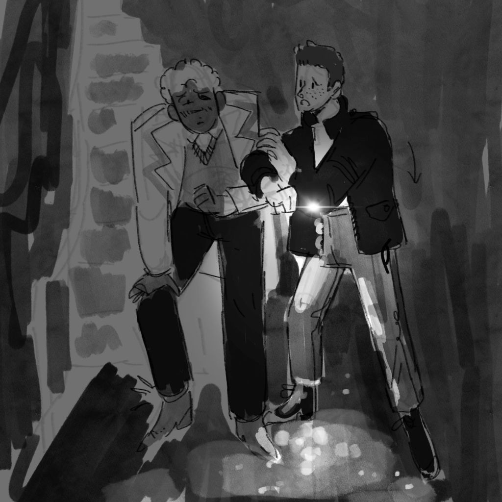
I sketched out thumbnails traditionally, creating five or six quick compositions to see if I could get lines of action exciting, highlight where the load was being borne (Drake is taking some of Ludwig’s weight, which is important).
I created a proper sketch digitally, because this gives me a chance to resize proportions and get something looking good that can be reworked quickly.
Once I had this sketch, I worked underneath it very quickly in tone, and then a background. And then I threw a multiply layer on top because it’s dark, and then I remembered that they use their phone torches – a perfect opportunity to get a light source in there and stop it from being completely murky. What do they call this? A tonal key?
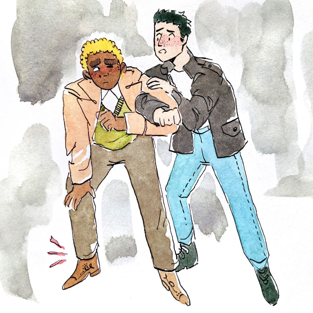
I took this sketch as an inspiration and created an ink drawing traditionally. I was proud of this too. Below is the drawing coloured, although it’s crucial that you know that I watercoloured the original after working up the digital illustration.
When I went digital, I tried out slightly tighter colouring alongside the very playful, expressive lines.
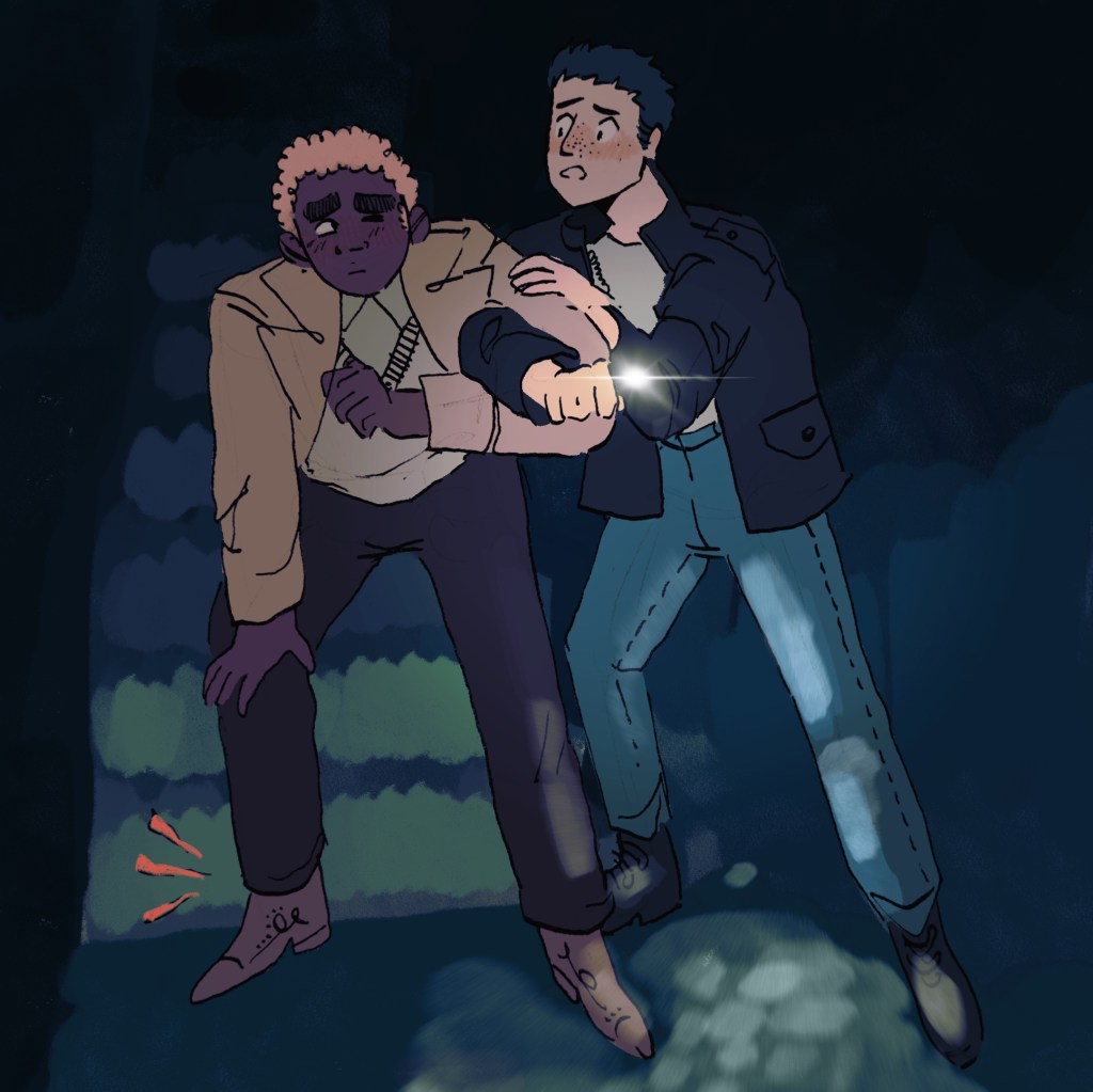
The illustration, when coloured fully, was a bit too saturated. You know when it’s dark and you can see fewer colours?
SO I created a gradient map with greeny blues and bluey greens, and shoved the illustration through that. It looked good and more uniform, but it was too green. I looked at my full colour version and my bluey version and thought, “I need somewhere in the middle of these.” Bing! Idea.
I overlaid the bluey version on top of the full colour version and played with layer effects and opacity. This meant that the blue version became a mask layer, but intimately responsive to the tone and colours underneath it – because it was just another version of the illustration. What came of it is this wonderful dreamy green-blue air to the image, but you can still tell what colour things are meant to be.
Ok, you’re allowed to go look at the watercoloured illustration now, because after I finished the digital one, I watercoloured the ink lines traditionally. This was intended less to create that dark, it’s-nighttime feeling. Rather, I just wanted it to capture the connection between the characters. I feel like overusing watercolour can make pieces a little dirty. A lot of Blake’s illustrations are just characters on white backgrounds, but they sing to you because you feel this wonderful energy coming from the characters or their interactions with each other. Just so you know what I was going for.
I think it’s hard to decide which of the two pieces are more successful, because my intentions were different for each (depending at least in part to the limits of the media I was working in). But I love the digital illustration, because you get more information about the story, context, temperature, time of day, etc. And that’s just because I’ve been writing for it.
