I actually made this progress yesterday, being busy today with opt module research and pottery and a big tesco shop. Life comes at you fast!
Something had been bothering me about the earlier set shot: the pencil was quite transparent, and didn’t have the oomph that I thought it needed. I went back to my raw assets and duplicated both layers, so that the linework was more opaque, and replaced them in the shot – and you can see that it’s a much more confident shot now.
I think when I go to add to this I’ll make the title screen come on for a little longer, so people can read the full definition. Next up is a few text screens, some interesting audio, and a little more. Hopefully, I can get to tightening the screws by Monday, so I have a couple of days to polish it for the crit.
Ok, I’m eating a Pita Bread with mango chutney because it is literally the last carbohydrate in the flat: time to do some research.
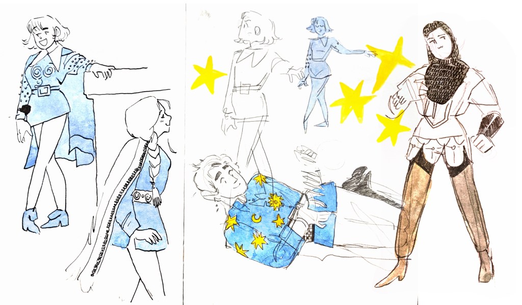
I should probably start by specifying some themes I’m really interested in. Right now, it’s looking to be indulgent historical and fantasy fashion. My characters are always interacting, but I’m trying to think of a print for ornamental purposes.
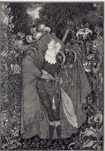
The Abbe, Aubrey Beardsley, 1895.
This is great. I hadn’t put any search in at all, but clicked gender and sexuality because the thumbnail for that collection was an incredibly sexy woman in a suit. They know how to reel you in at the v&a museum, that’s for sure.
This piece interests me for a few reasons: it’s pen and ink wash, which I’ve been working in recently, but most importantly, I looked at their fluffy bow and ruffles and big ridiculous cloak and – out loud – went, oh, fuck yeah. This guy’s head is thoroughly getting lost underneath all this drip.
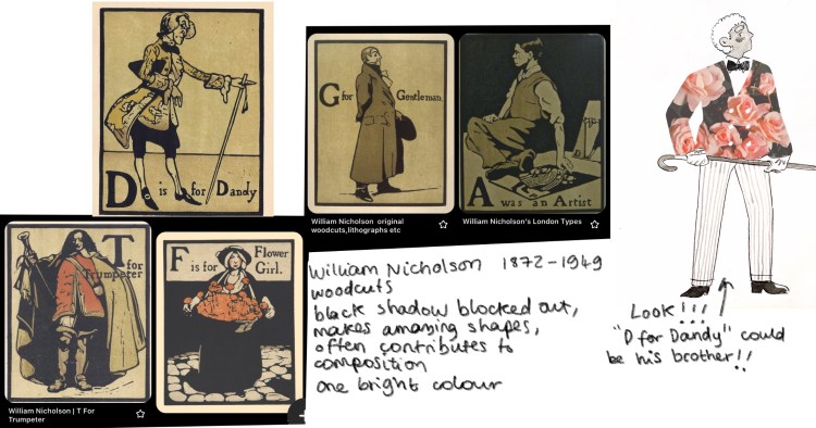
I say that, but it’s not getting lost, because the head and ruffles are the largest pure white space in the image, so the eye goes straight there. So: fashion inspiration, as well as inspiration for how to create tone and movement of fabric – note the lines following the curve of the fabric. I’ve been toying with the idea of using black lino lines over stencilled areas of pure, bright colour, like a two-colour woodblock. A la d-for-dandy, which I’ve not stopped thinking about since my last research post. I’ll throw the relevant image back in, because it costs me no memory to paw back through the wordpress media library.
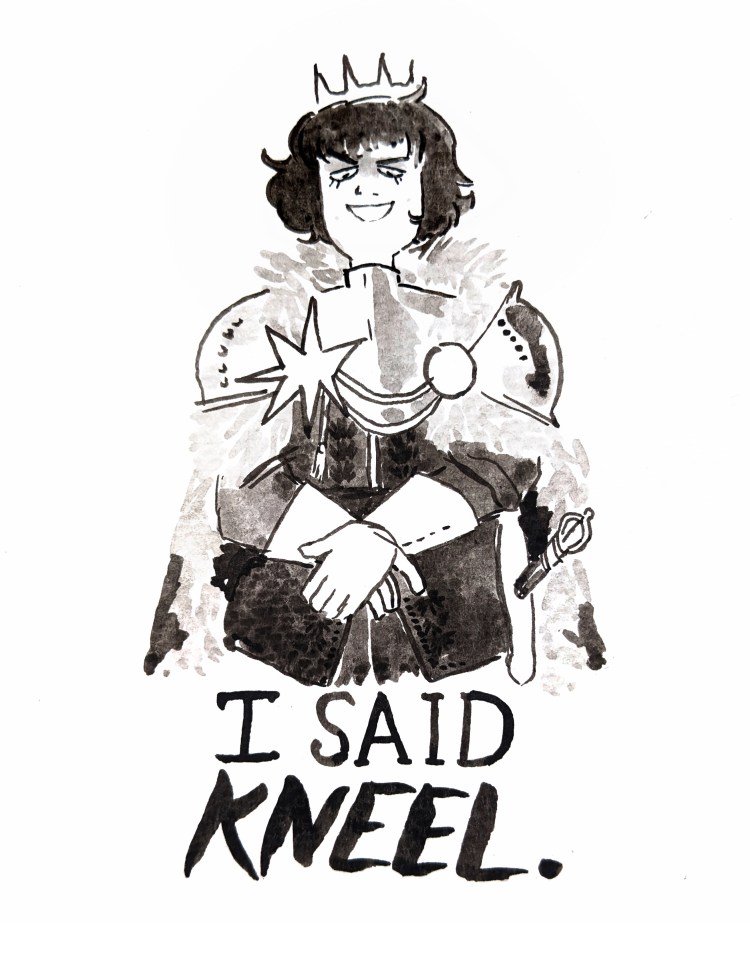
Looking at T-For-Trumpeter, the front-on pose, self assured expression and gestures, cloak creating a large and imposing shape – and even staff-like-object coming up from the side all chime with the ink drawing I did of Mitzi two days ago .
Seeing them side by side, we even put the darkest tones in the same place – hair and under the arms. I always get quite emotional when I find my art chiming so closely with historical illustrators, because it feels like I made a friend.
Later edit: we needed to do a big Tesco shop, in part because of Pita Breadgate as mentioned above. We now have regular human food, like bread and cereal. I’m drinking a hot chocolate as a reward, and it’s time to do another bit of research.
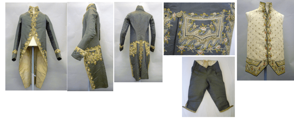
Ok, I went to fashion, and found this:
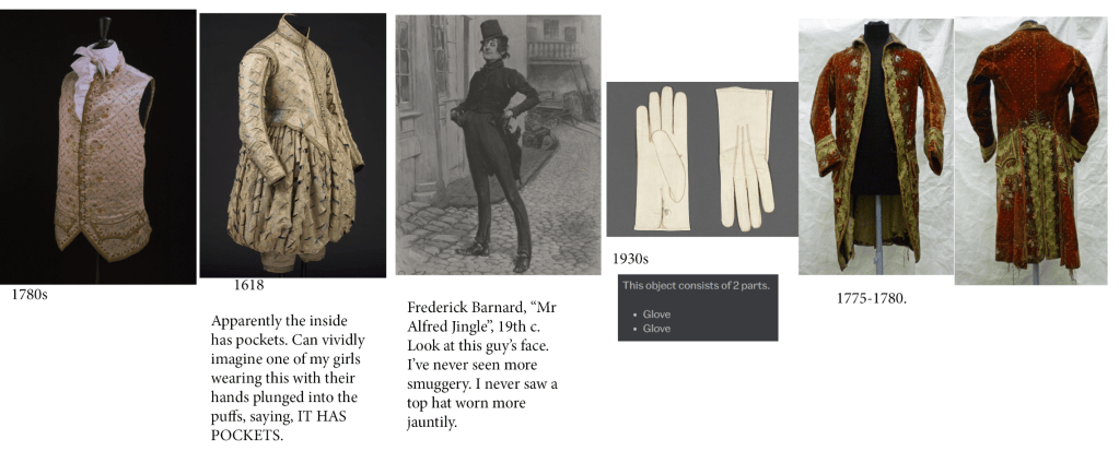
France, 1700-1799. A man’s court coat, waistcoat and breeches; the coat of silk taffeta, narrowly striped in purple and white, with a 3-inch (7.5 cm) standing collar, 2-piece sleeves ending in cuffs, 4½ inches (11.4 cm) deep. The fronts curve sharply from neck to hem with pleats 1¾ inches (4.4 cm) deep, below the hip set beside the centre back. Each front has a pocket and shaped pocket flap; the centre-back seam is open below the hip. The coat, sleeves and pocket flaps are lined with white silk twill, the pockets with bleached linen. The coat is appliquéd with green silk and white net in a wave pattern and embroidered-to-shape with silk floss in shades of pink, green and white in a pattern of roses and pansies, on the collar, cuffs and pocket flaps, around the front neck and pockets, along the fronts and centre-back opening. There are 9 embroidered buttons along the right front, 3 on each cuff, 3 below each pocket, 1 at the top and hem of the pleats.
The waistcoat fronts are made of ivory taffeta with a 2¼ inch standing collar, curving fronts and skirts reaching to the top of the thigh. Each front has a pocket and shaped pocket flap. The back is made of fustian and the waistcoat lined with the same. The fronts are faced, front skirts and pocket flaps lined with white silk twill. The waistcoat is decorated in the same pattern, but different colours as the coat, appliquéd with green silk and white net in a wave pattern and embroidered-to-shape with silk floss in shades of pink, green, yellow, terracotta, blue, purple and white in a pattern of roses and pansies, on the front collars and pocket flaps, along the front edges and hems. The fronts are filled with repeating embroidered abstract floral sprigs and feathers.
The written description of this coat is like looking at sweets in jars at a sweet shop. “Silk taffeta”, “White silk twill”, “Fustian”, “silk floss in shades of pink, green, yellow, terracotta, blue, purple and white”, “Roses and pansies” – I really taste fancy chocolates when I read through these phrases.
I would love to stay and do more, but pottery calls. Stay tuned: now I have some ammunition, I want to make some drawings for idea development so I can get good boy points and a shiny degree.
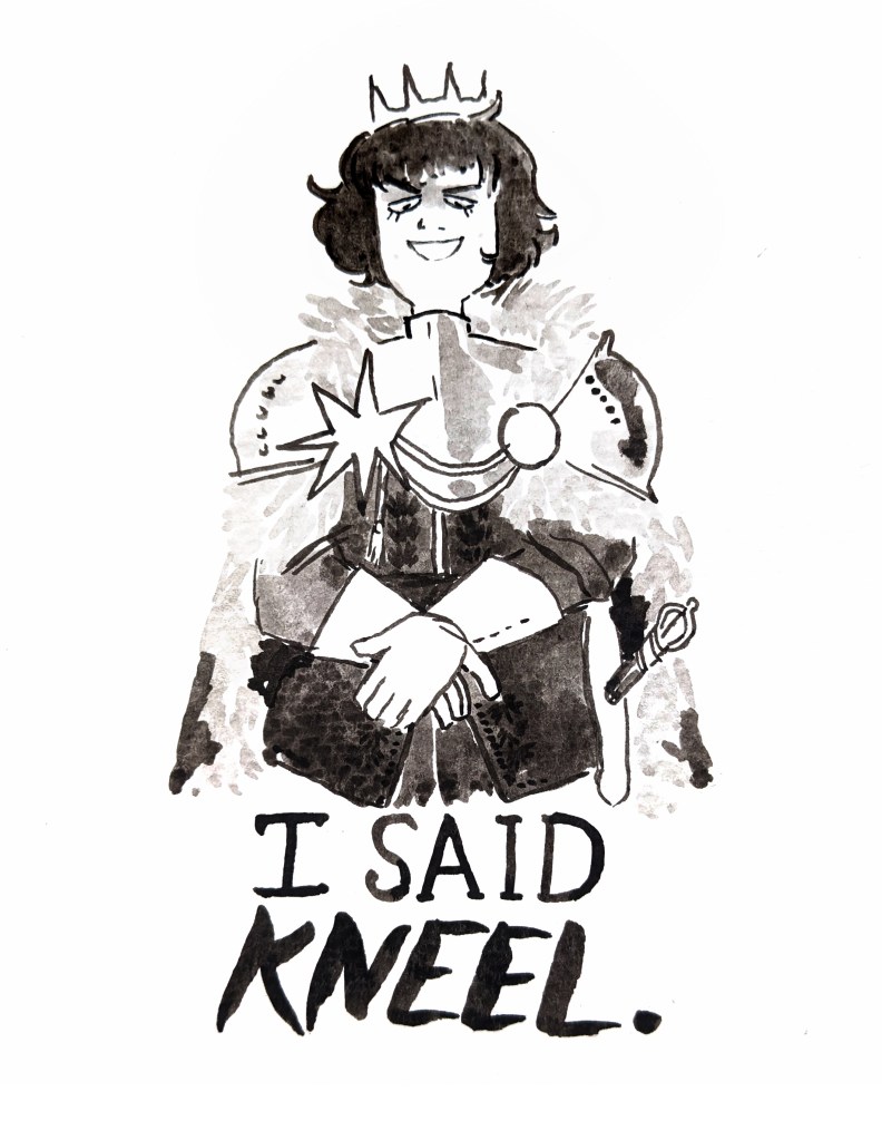
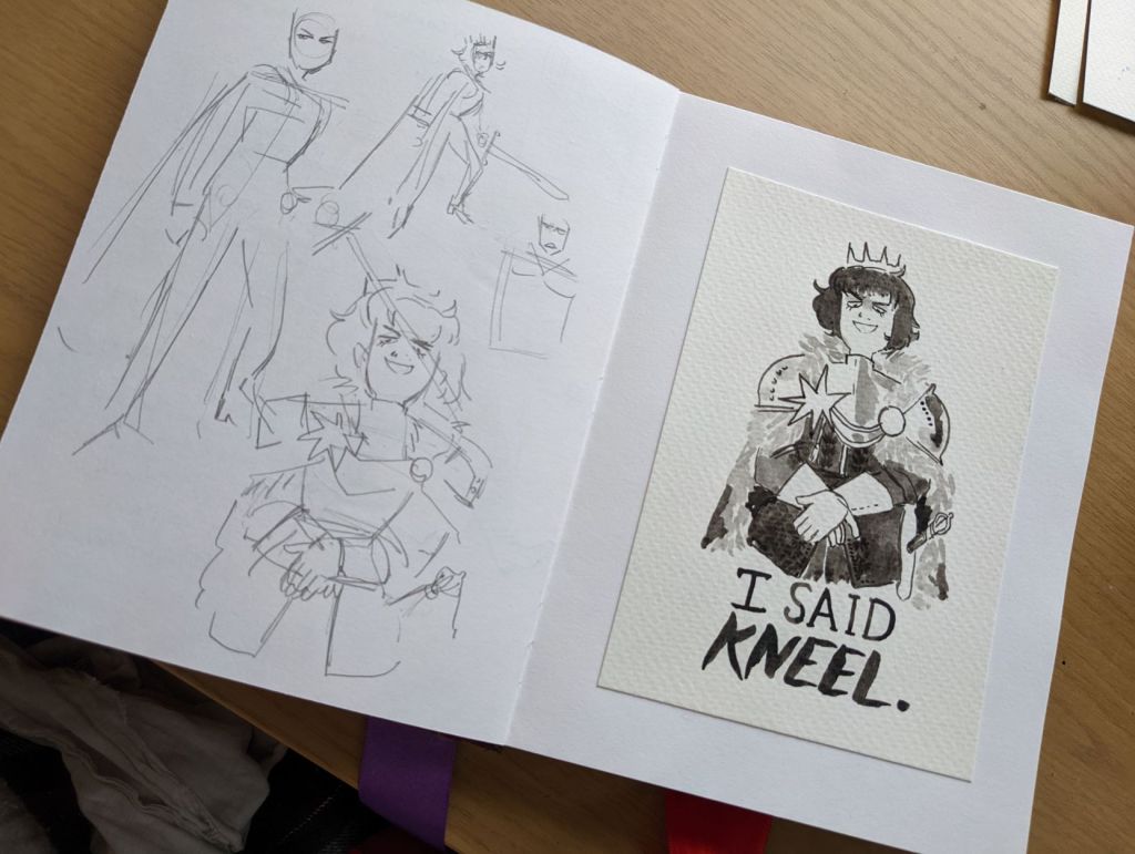
Over the last 24 hours, music again has taken on that fantastic quality I need to make something completely new and inspired. Last time this happened it lasted for months, but I’m learning just to ride out the waves. This is Mitzi.
Mitzi is a spoiled King in my Kingdom!Au, and is also the “King” of the Court in the New Canon AU. She always plays the villain, and embodies qualities of apathy, laziness, greed, power and even sadism to different extents where it becomes relevant. In real life, she’s just a sarcastic layabout who spends too much time on the internet.
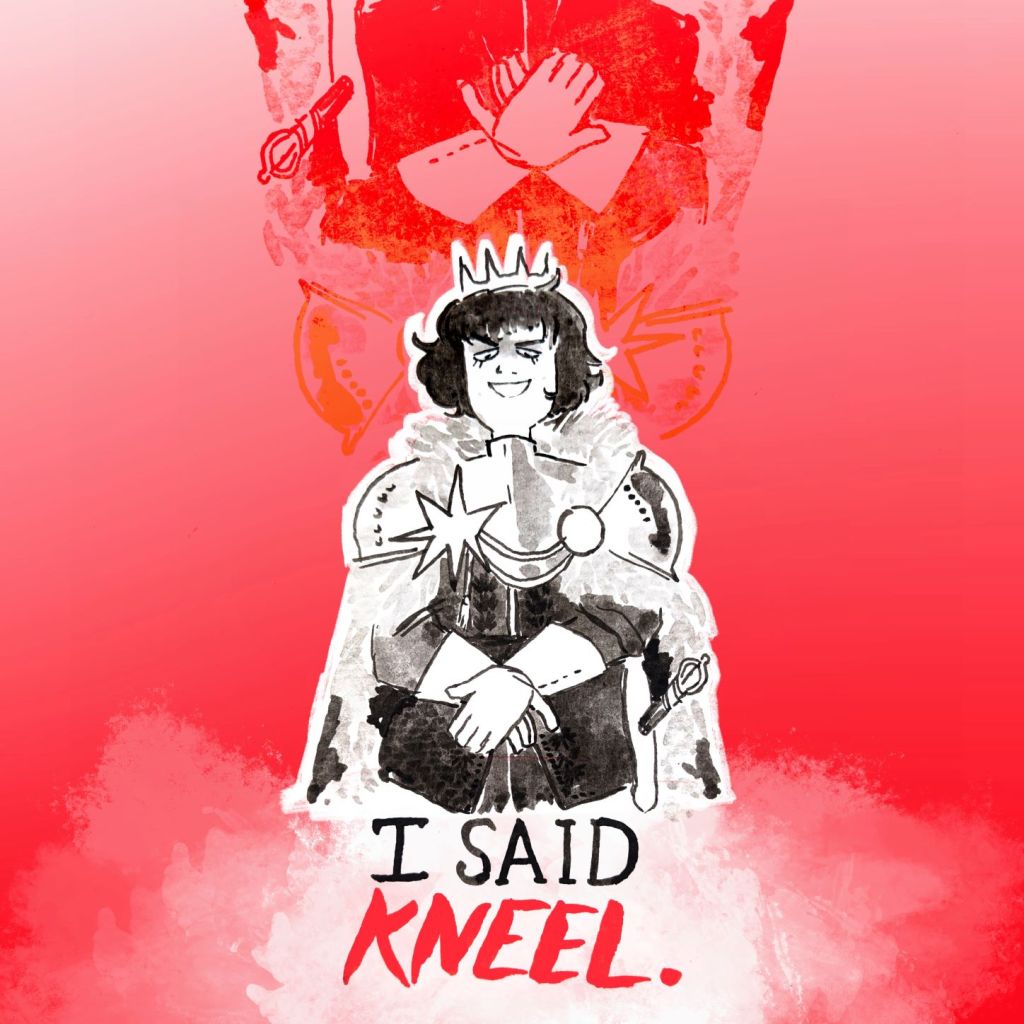
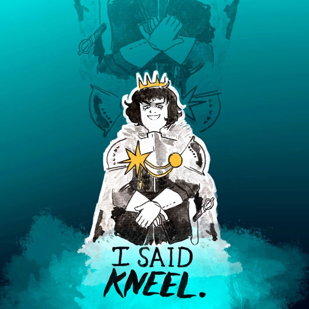
Had a fantastic time editing these. The idea actually came because the photo I took of the ink drawing went into my camera roll upside-down, and I looked at it and thought… oh, hell yeah.
I really enjoy playing with upside-down things, especially type. Makes the viewer work a little harder, or makes the type more purely ornamental, rather than central to reading the image.
The pages are laid out in a convenient way to show how this image moved from idea to pose tests to ink. I like to sketch the MOST BASIC proportions and key points under my ink, and perhaps get the expression right, and then leave most of the detail to the inking, so I retain that expression and directness. My inking process matures.
I worked hard at biting into some of the meat of this project today. There’s just … so much of it. I had hoped to miss the audio lesson today as we were told it would be Monday, but they’ve pushed it back to Thursday! Bums. Anyway, I got more done at home than I could possibly have at the studio.
The process for this was: I filmed Jamie putting up some newsprint like a poster. I then took useful screenshots of keyframes. I put them up as reference – not traced – and drew Antonia’s arms based on the movement. There was actually another less successful “poster falling” animation. I knew it wasn’t great, and Jamie pointed it out too, so I did another: the one you see above: and it was far more organic and successful.
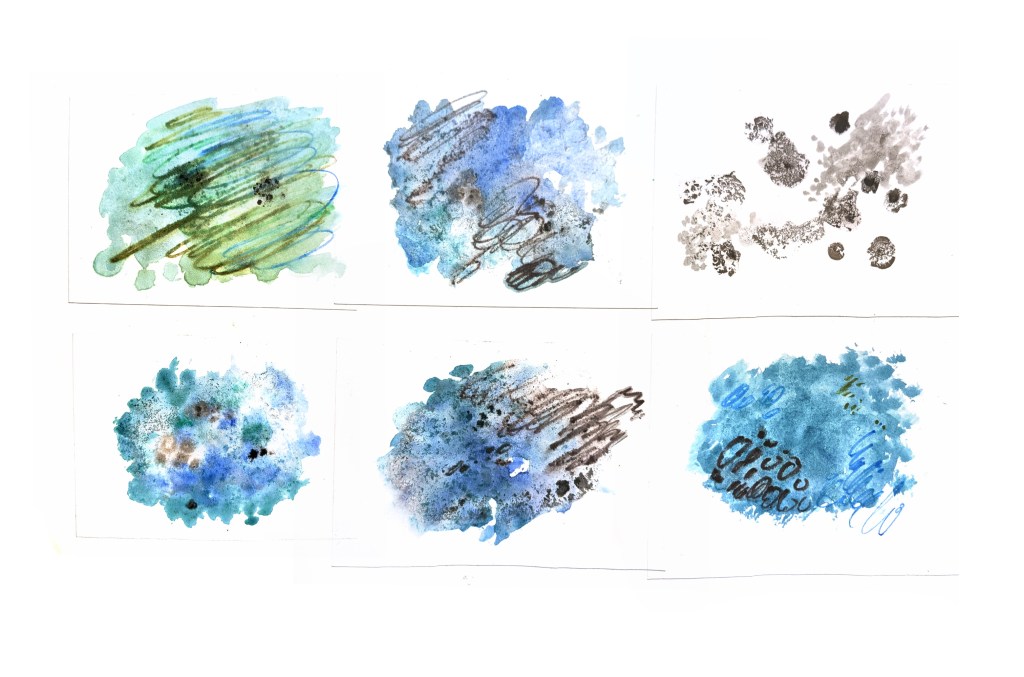
Today’s work also included making the six mould textures on watercolour paper and cycling them nicely in the background.
I also made a paper sculpture of the house based on some thumbnails I made on the weekend, lit that interestingly, filmed it. I also created the gently boiling lines of the bedroom (or “main set”). All this with the hope of getting all my assets together to create the first few shots, up to the title of the piece! And we made it!
There are points of this I would improve on, but overall, I’m really proud of myself. Just the act of getting this much done is impressive, and every new shot I create I learn new things about Premiere Pro, what I can do, what works, what doesn’t.
The big thing I had trouble with was reconciling the digital and traditional, and the different shot methods, to create a clear sense of continuity and grounding. I remedied this somewhat with the colour correction and tint in Pro. I also plan on rain audio playing throughout the shot, keeping the viewer grounded in the atmosphere. Next stop: the fun part: Antonia! OH- One more thing.
Here is a video showing the raw footage of the opening shot, and of a less successful shot of it where the tint still wasn’t tying it into the mood of the piece well. This project, as you can imagine, has been chock full of continuous assessment and tweaking, but I’m trying to evidence some of it.
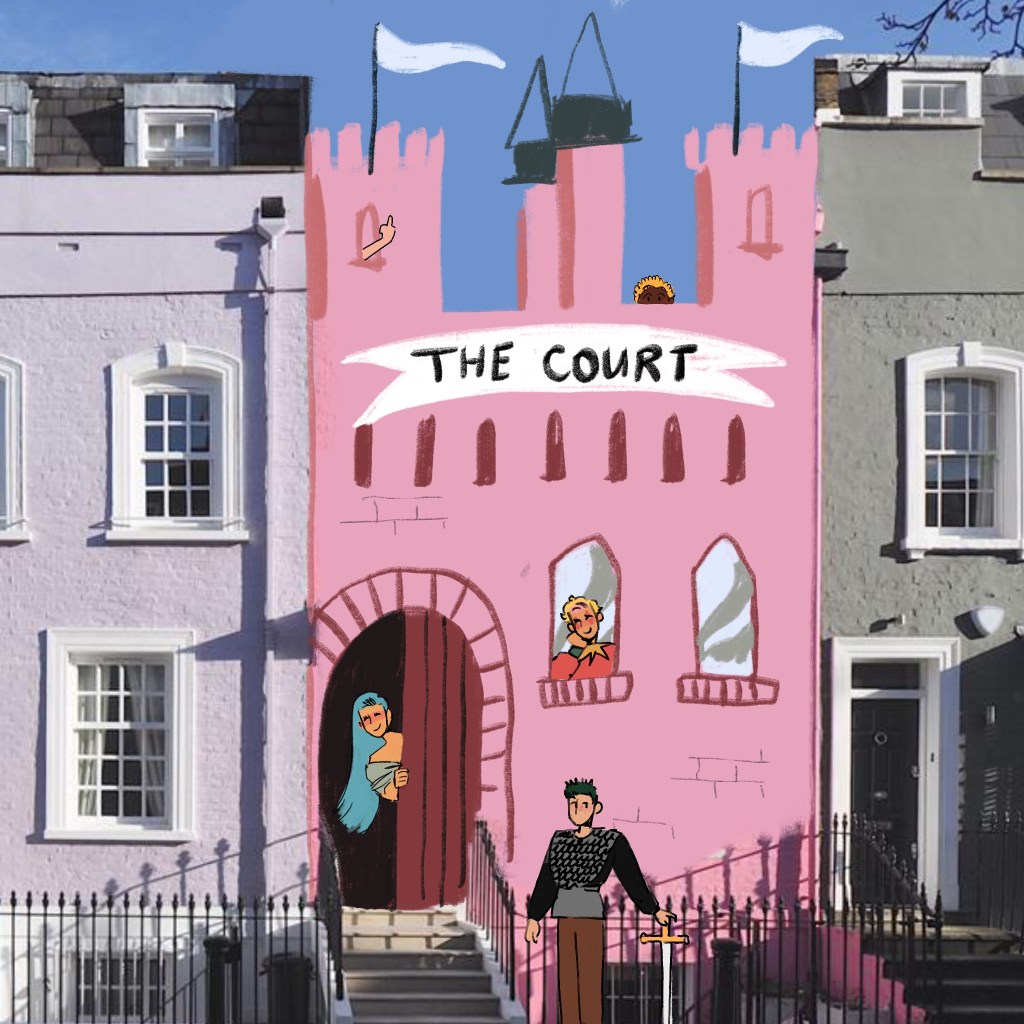
A self indulgent doodle on top of some colourful seaside homes.
The household that Techo, Mitzi and Ludwig live in becomes known as the Court once Antonia joins the crew and it makes all five of them.
I love the idea of blending my universes with their modern reality. When they move into a second, bigger house all together, they fill it with wonderful things and call it the Court officially.
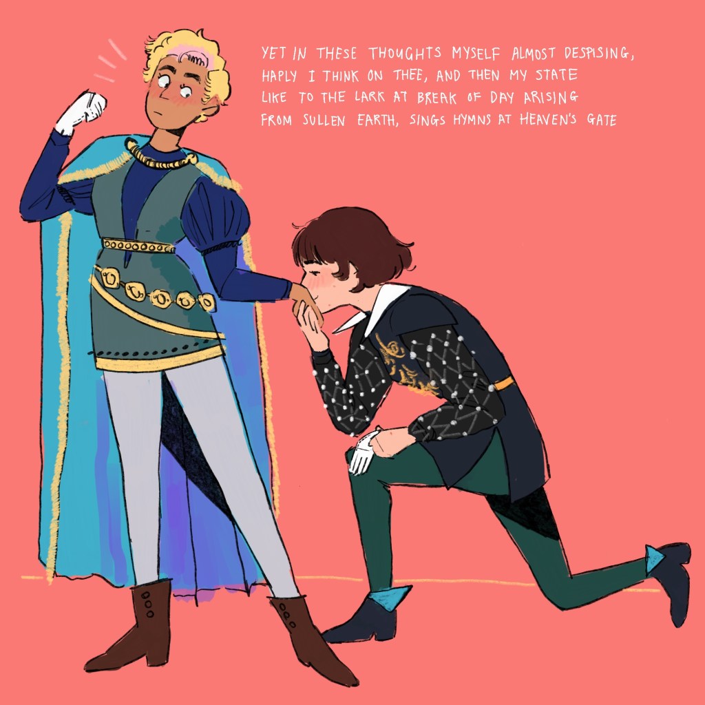
Outfit inspiration taken from Court Jester outfits. In the Kingdom!Au, Mitzi is King and Antonia is a jester – so the dynamic of Mitzi kneeling to kiss Antonia’s hand has me absolutely reeling.
How to alter the position of multiple clips at once: right click “Motion”, click “copy”, select another group of clips, click “edit”, click “paste”.
Things I did not learn today: how to relocate lots of media at once from the same folder. It says it should do it automatically but it did not. But no matter: it is done, and it is successful!!!
I would desperately like to talk about my process, but it’s 00:14 and Glad You Came by the Wanted is playing out of my phone speaker next to me, so this is no environment for articulate thought. Come on Eileen has started playing now. I searched “songs to take a long shower to” on spotify.
oh tits. I think I accidentally hold a frame per loop. Ah well, the effect comes across.
The harsh boil works well for the mould. I think it conveys a feeling, something like hostility or oppressiveness.
Something wasn’t clicking today. Maybe I was all arted out! Ideas for the next things to try will be drawing from life and figure drawing, maybe with ink because I’m loving how tactile and flexible it is.
I saw in an email the other day that the BBC are asking the Brighton School of Art for a 15 second pre-title animated sequence.
For context, the two things the brief asked for specifically is imagery tying in to Paddington (as it’s his 65th birthday), and to feature the four presenters. Below is what I intend to submit.
It’s one of those things where if I don’t make it, I won’t be devastated… but if I did get chosen… I would kickstart my career in a champagney party at Brighton Pavilion Palace next to ed gamble.