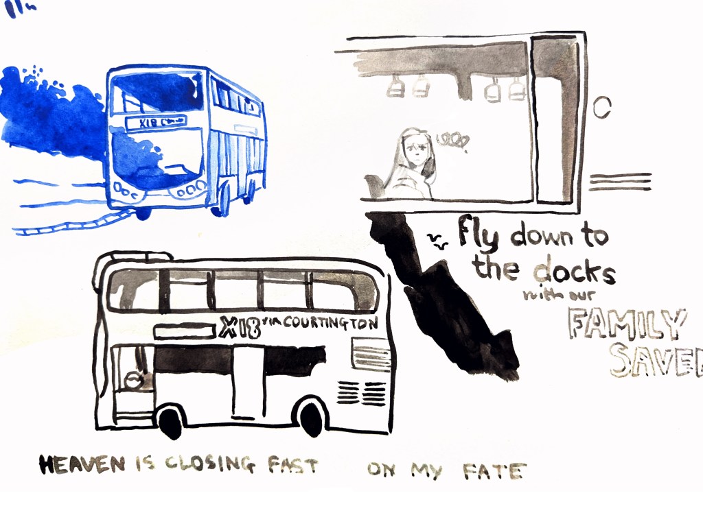
Ink drawings inspired by the bus route from Mauve City to Courtington. The group take the bus often as most of the good bars and their favourite club are in the City.
Proud of these! Especially the blue one! I edited techo into this – the ink drawing of her was another sketch I overlaid because the original didn’t have quite the right expression.
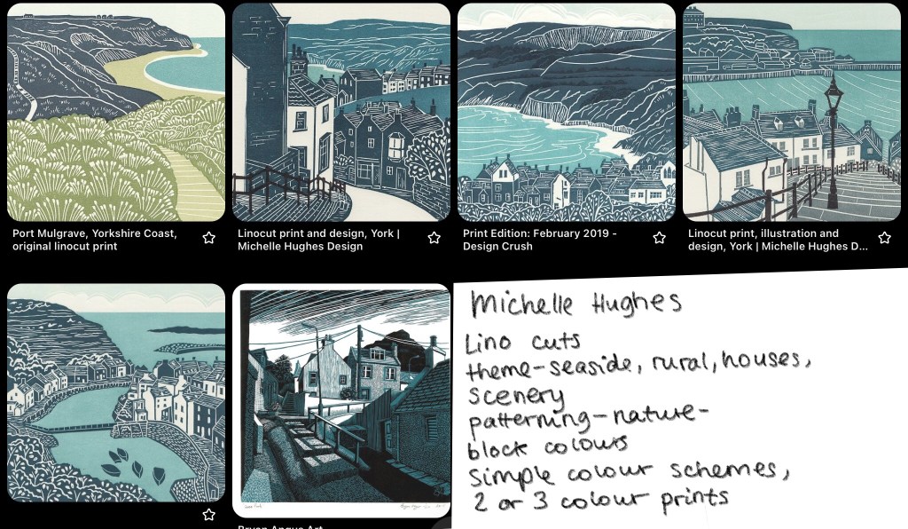
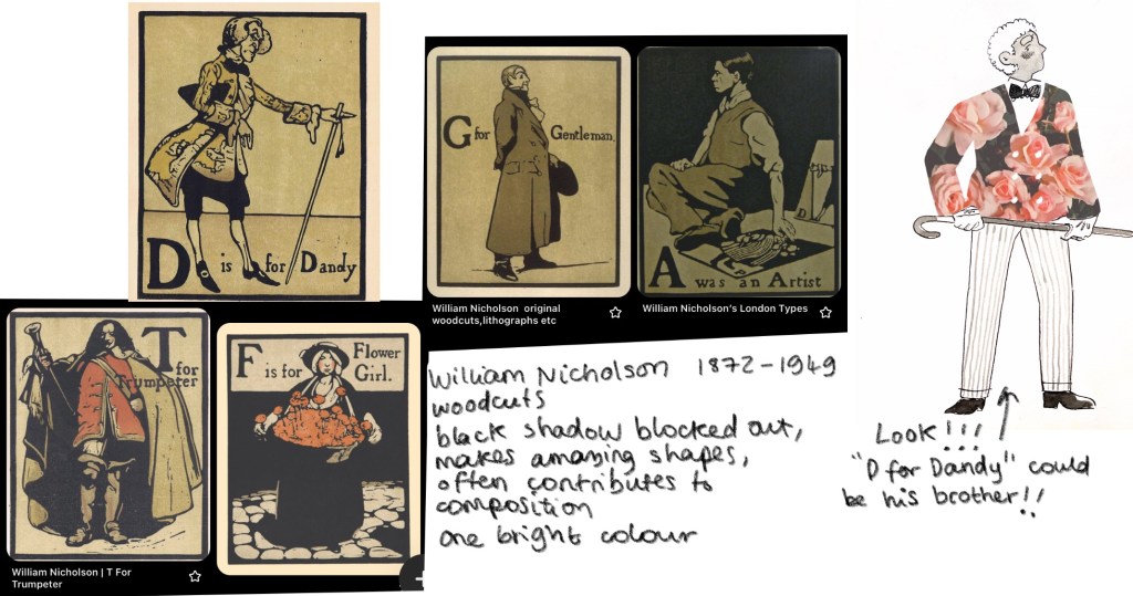
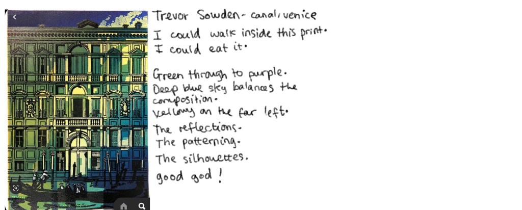
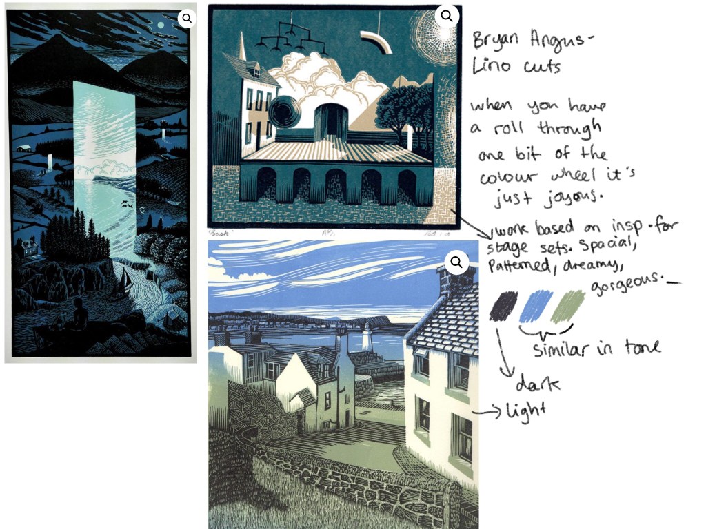
On my week off class, I took the chance to start a printmaking Pinterest board of my own. I started taking pins from Phil’s pages, then moved on to researching artists he’d mentioned on his slides throughout the weeks.
Below are a few specific notes I made, but in the meantime I’ll keep collecting and being inspired by different printmakers.
The itching in my head and hand also led me to create this yesterday.
This art made me happy. It made me happy because I was visualising something I’ve spent some time thinking about, and because I worked SO quickly and still love the way it looks. I think the shapes are really successful, and the character (me in this case) has a lot of life.
I’ve been distracted these last few days. Feels like something big is swimming around in my hands and brain and I need to work to get it out. This is one such attempt.
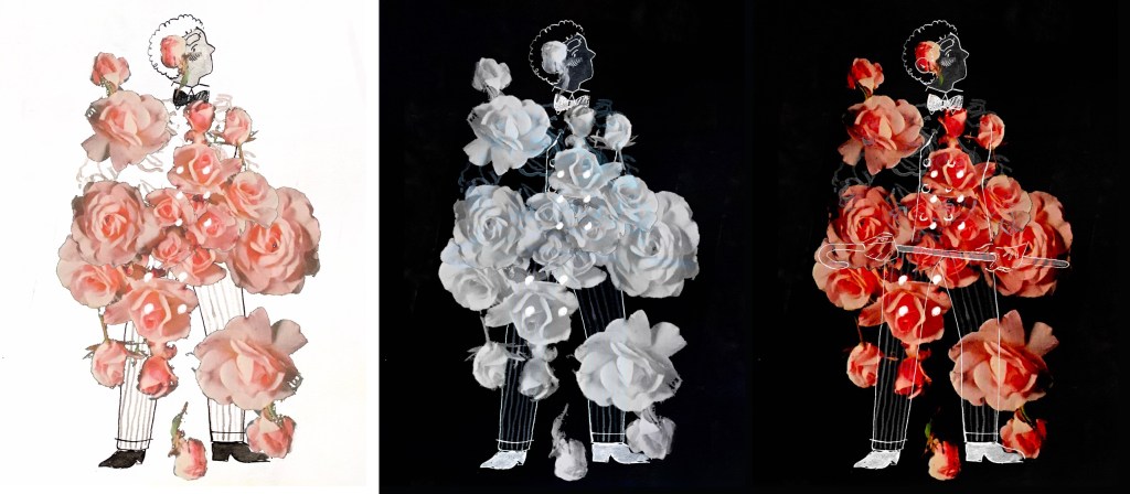
What you get to see with me saving my iterations is a lovely journey where I get freer with the concept. Selecting the roses messily was a slip of my hand and a mistake, but I realised I immediately loved it. I didn’t even move it from underneath the clip layer: the way it crowds the rest of the image is organic and gives it such a wonderful feeling.
I copied the roses and opened them out to the legs, creating three more iterations. Pin light featuring at the end as a little treat.
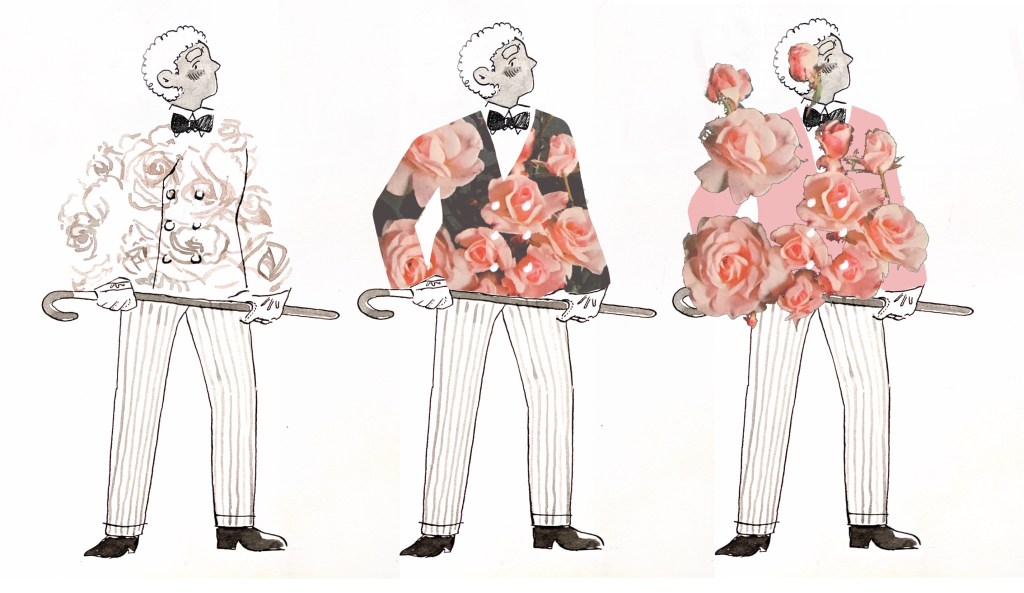
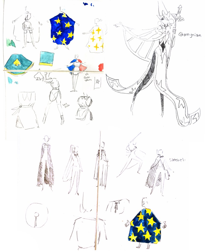
My interests are really moving around to fashion. I know it’s just a phase, but if I harness this right I might be able to create some really interesting work or even work with fabric.
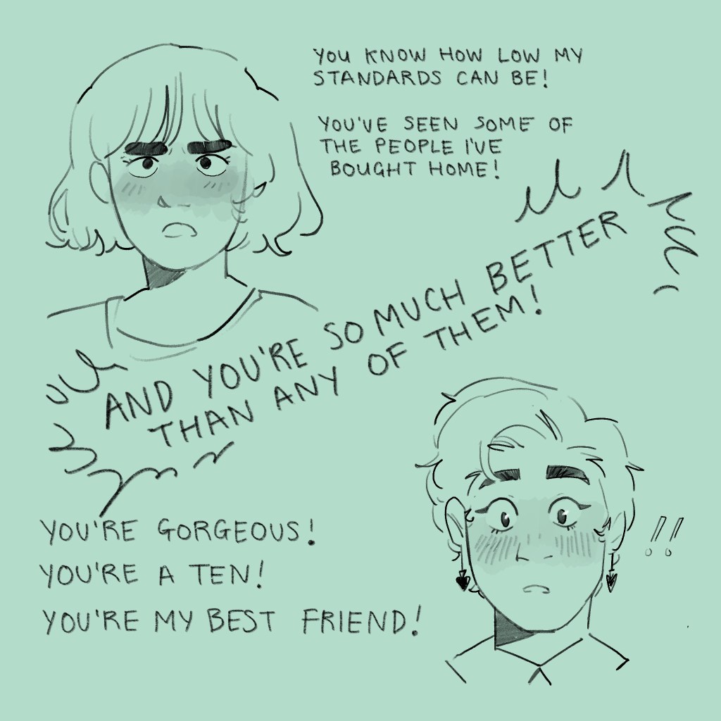
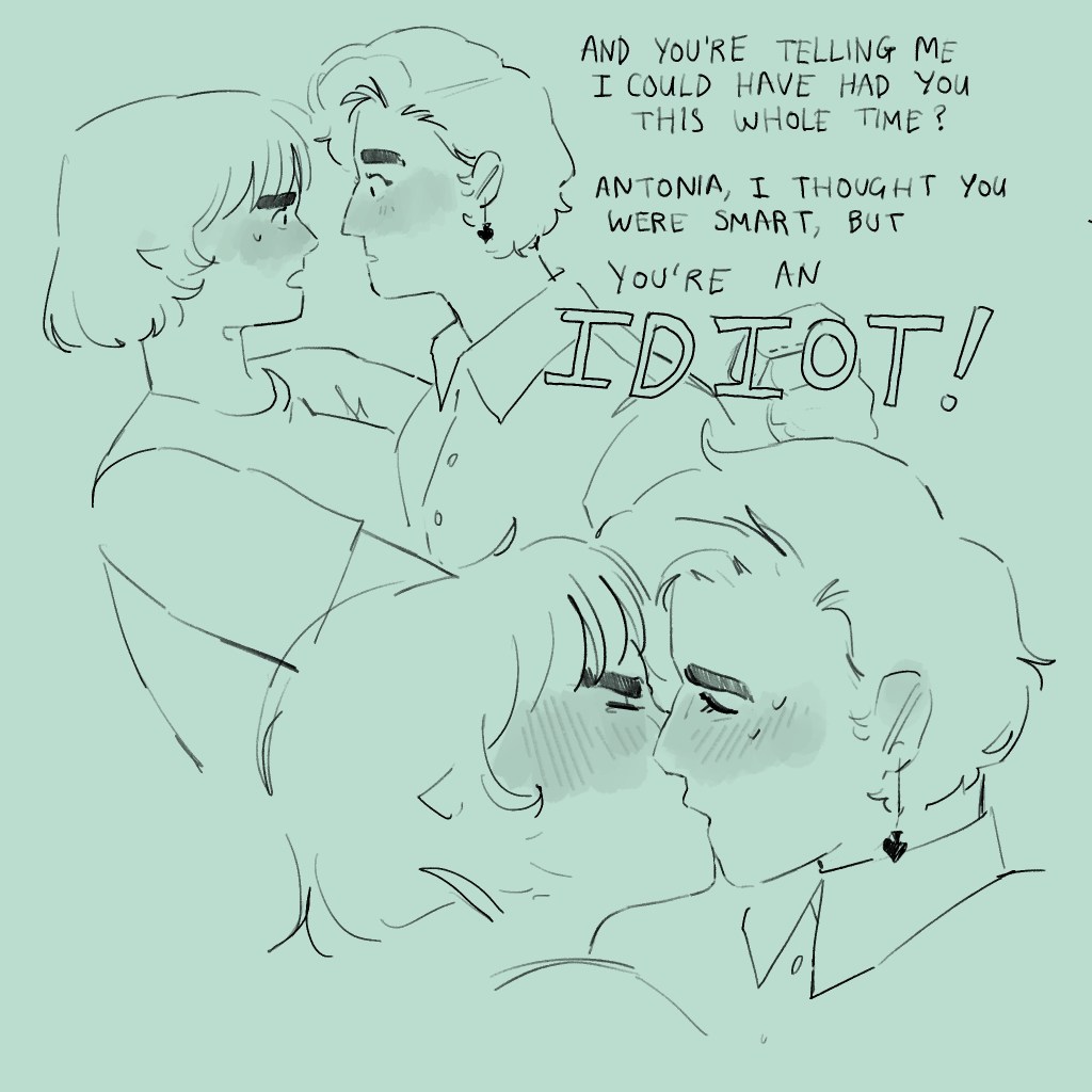
The inspiration for this piece is rose tea, one of the teas that Ludwig and Techo collect together. Their collection is one of the things that brings them together, and the tea means spending time together, drinking, eating, living life.
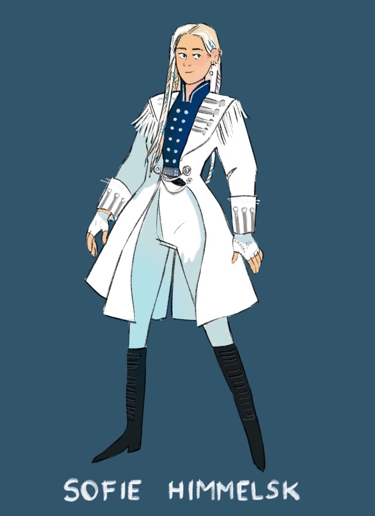
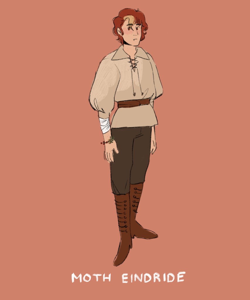
It might be nice to make one or two more of these. The suit is based on a range of early twentieth century fashion research, particularly from a few fifties designs. I will never tire of drawing Ludwig in a pinstriped suit. You know he becomes a tailor in later life?
Below is a flip through I did quickly this morning. This flipthrough is intended to be a “before”, hopefully, so I can go back and compare how I made the work more cohesive today.
Having talked to the tutors, I’ve received many different opinions on how I can tighten the project. Some are more doable than others, so I’ll see how far I can get.
I’m thinking of changing the colours and fonts of the written things, to better work with the conventions of office stationary and post it notes, and to better illustrate the characters.
My head has been elsewhere these past few days, and there’s no particular spark for this project any more. I can’t have it all. I’ll be professional as I can and get it looking better, but it’s a shame, because when my heart is in a project I think the content sings.
LATER EDIT.
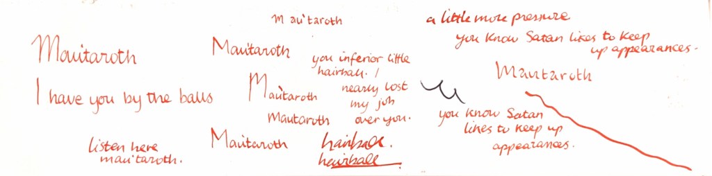
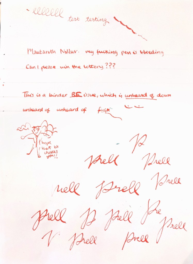
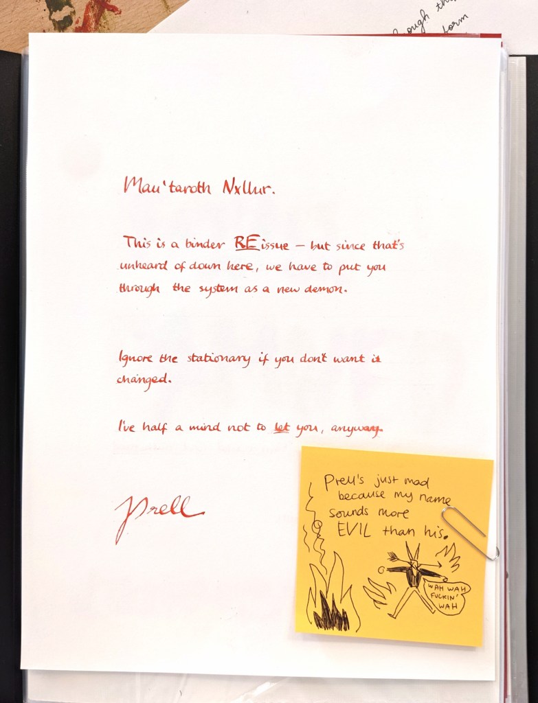
This is less of a finished thing and more of a refining. I spent some time testing out different papers and handwriting styles for Prell’s paperwork. I wanted to strike a balance between formal and quickly – written. Using the dip pen meant I could imply expression because it shows pressure changes.
Another issue I had when people were looking through the binder was legibility, so I focused on using clear lettering that was easy to understand.
I also mocked up a couple of post it notes for Mau’taroth’s voice. Using black ballpoint pen is a better fit for his voice, because it fits with the convention of doodling on sticky notes. There’s also better contrast.
Below is the first page of the paperwork, and compared to the original, I think it’s a lot more successful for the reasons stated above.
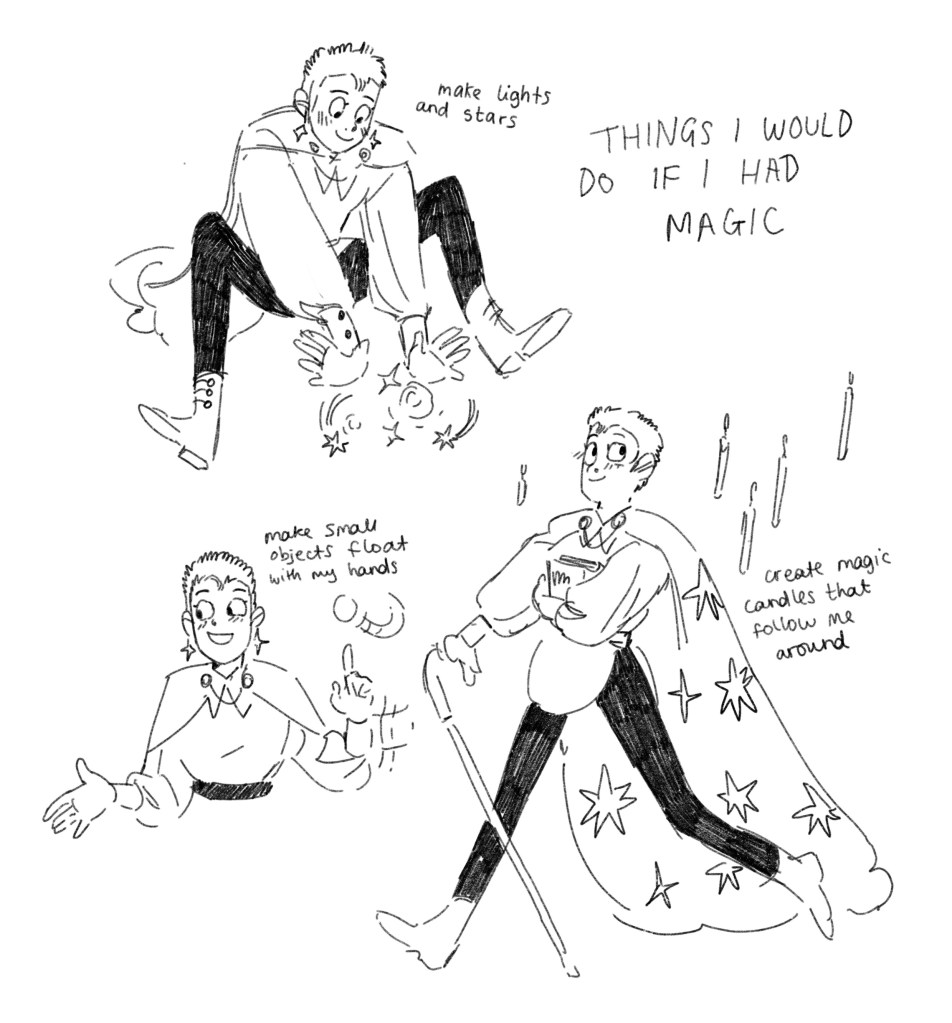
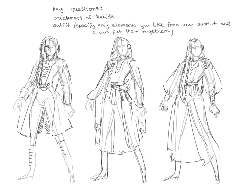
It seems that the most incessant phases I have are fashion related. I realised suddenly that one of my favourite things is designing and describing the outfits for my characters, and my whole fantasy kingdom sold dyed fabrics as its chief export.
I really want a cloak. A brightly coloured one. I want to wear it around the university and to various dates. I also want a long shirt with slits up the sides that I can cinch at the waist. The clouds have descended upon my vision and I can think of nothing else.
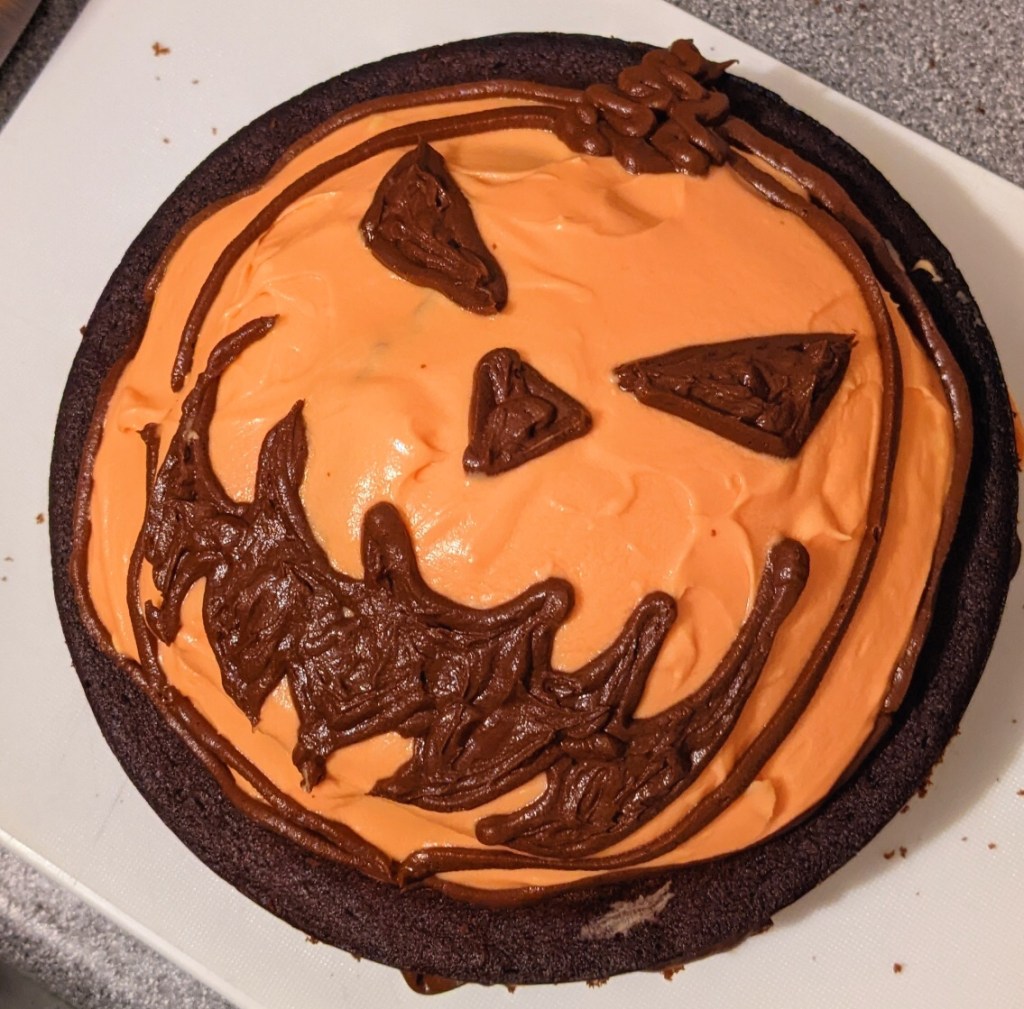
I opened WordPress and wondered why I hadn’t blogged in a while, and remembered I worked a close yesterday. I spent today baking a halloween cake with Hana, while Jamie, Ben and Damian played Magic the Gathering. It makes me happy. I wrote up some headcanons for the characters as they get older. They’re all going to live in a house together.
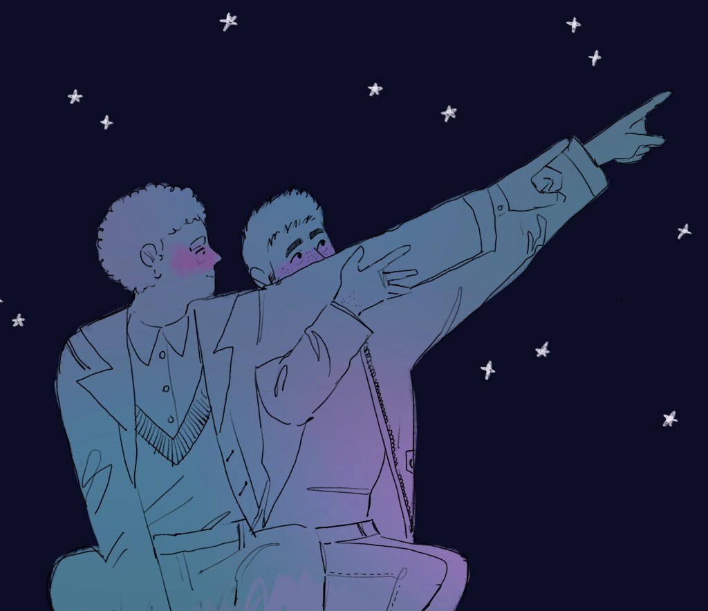
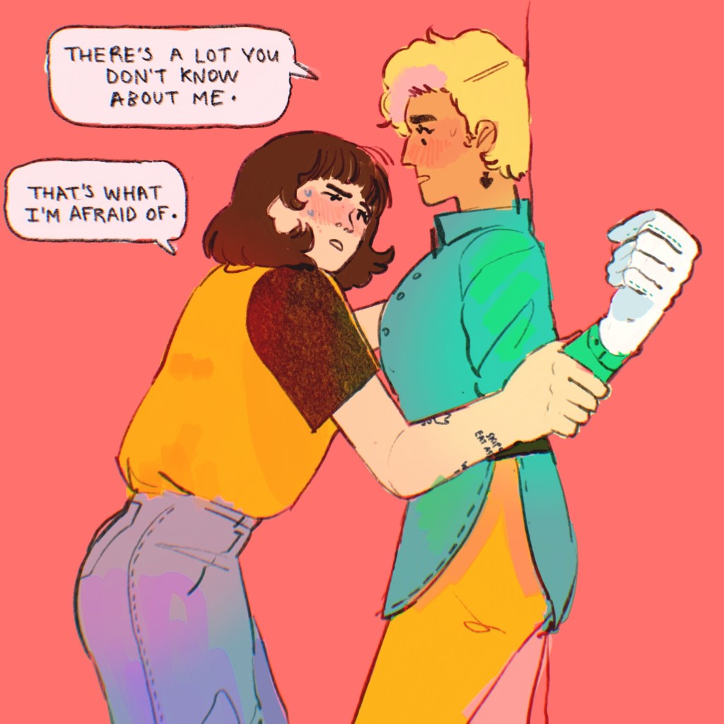
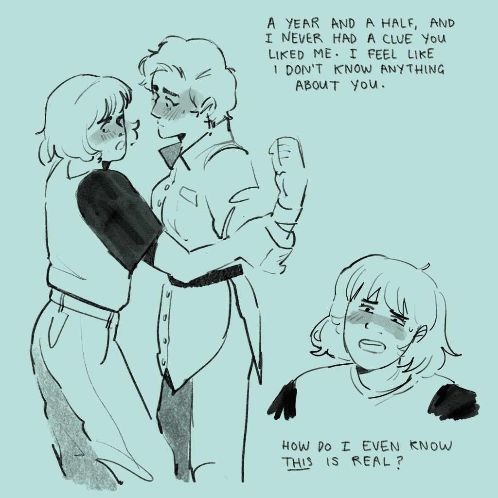
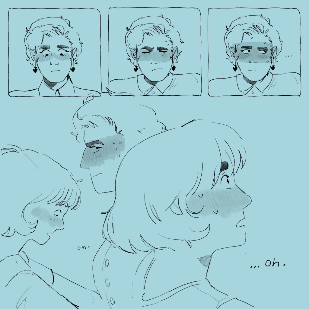
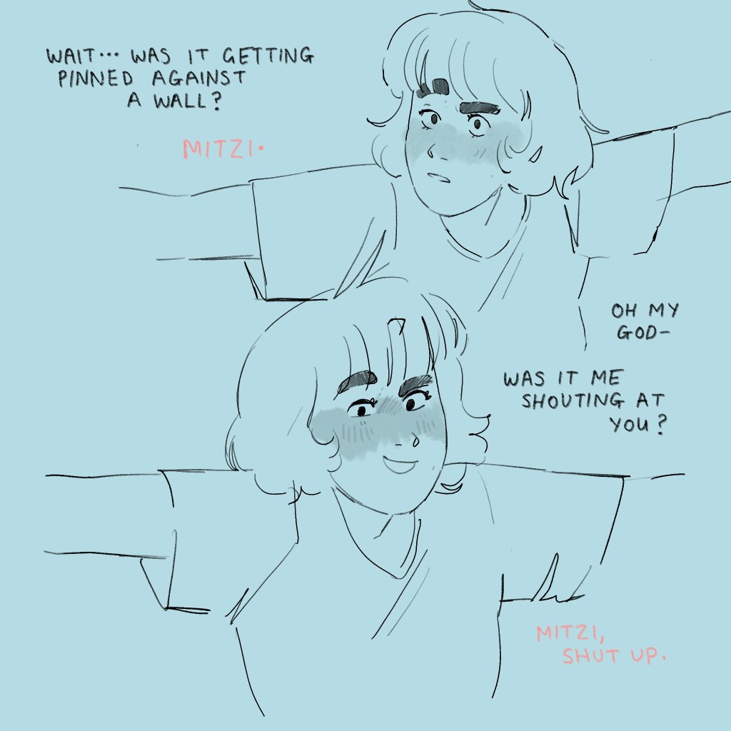
I drew this image the other day and then proceeded to not think about anything else until I made a little narrative comic for the moments following.
I don’t usually commit to words and images so intimately together, but I saw these quite clearly in my head when I thought of the scene.
I’ve drawn kisses (and, indeed, interactions in general) since time began, and I’m happy with this one. I think I’ve indicated where the force is coming from (pushing upwards, through Mitzi, since Antonia is against a wall anyway) and I’ve smashed that emotion with that angsty little eyebrow and the crinkle in Mitzi’s nose.
I went for the slightly overlapping images inspired by shiiocha on Instagram, who’s informal, doodly comics come together as more of a continuous experience than comics that are more boxed in. I think it worked!
You can see even within this comic I’ve experimented with brush for the characters and the type. I liked the clean, responsive feel of spectra, which you see I use towards the end. The thick, expressive gloaming you see at the beginning works better with one off pieces, perhaps? I just felt the other worked better.
I’ve spent a few days in -I’m not going to say despair, because that’s a bit dramatic, but we’re also not far off – about this project. When I spent hours downloading and figuring out Aero only for it to crash out multiple times on my iPad, I developed an ennui that’s taken a few days to shake off.
I used my other email address and got a second Artivive account, something I can’t believe nobody thought of sooner. And we’re back.
I remade the Sign Here animation, and made another.
I also had a brain wave, and know how I’ll be presenting the outcome. I’ve had my works on office paraphernalia since the beginning, and I’m going to create a display book featuring some of my Demon’s paperwork. I’ll be creating a little character that you can piece together by flipping through the book, evidencing the universe around him in funny ways. I’ve been making occasional notes.
An initial version involved me screen recording and passing the fire behind the cat, but I then bought it up in Premiere Pro and used key frames to create far smoother motion.
I think this is successful, and good fun! I’ll be contextualising it in the binder of work, as a suggestion for a poster that will be going up in the offices. I like that the eyes are the only thing showing until the fire reveals the shapes and lettering.
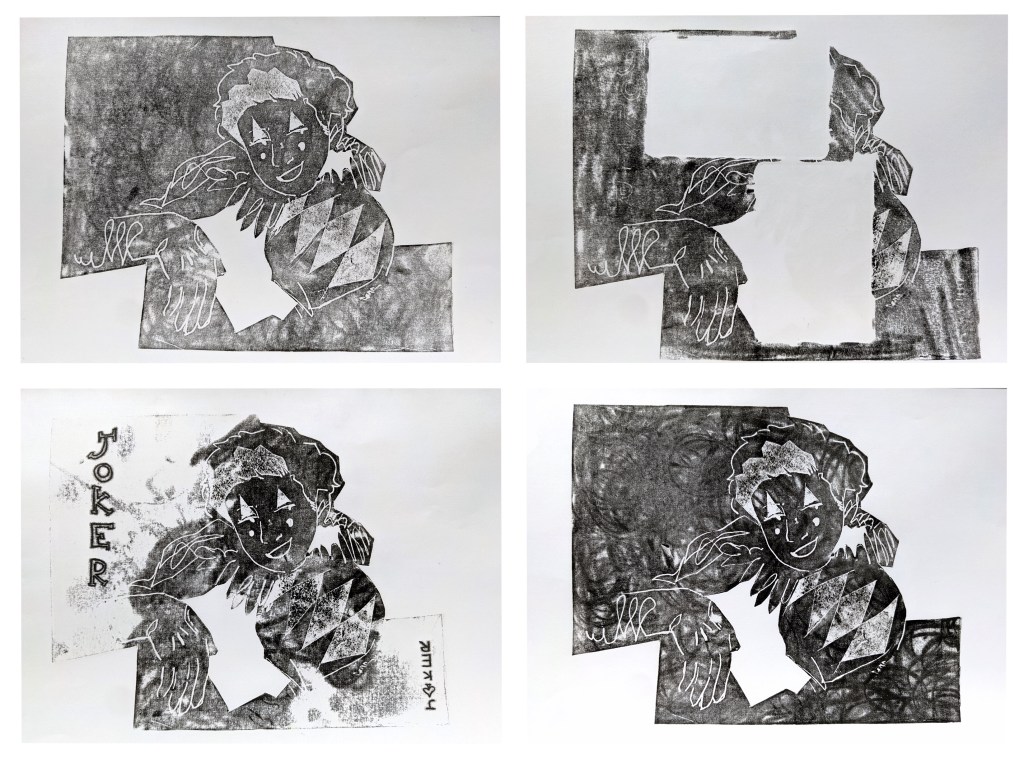
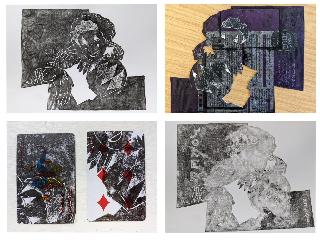
Yesterday’s session was taking relief prints from cereal packet card. I used a scalpel, scissors and a ballpoint pen to draw and peel away a design of Antonia based on an ink sketch you will recognise from my I Wanna Be Handsome blog post.
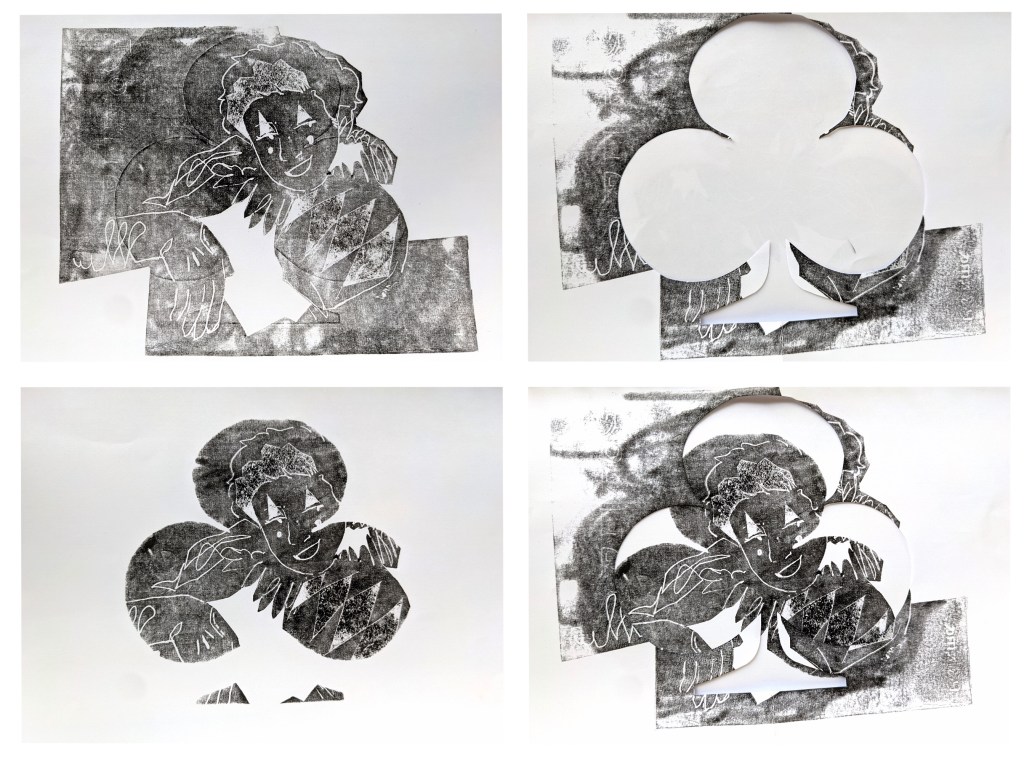
I was really interested in experimenting. I printed a few regularly, but then tried writing on manually to create a unique monoprint. I became interested in the repeat prints: whenever I tried something, the ghost of the experiment showed up on later prints. You can see this in the negative print of the JOKER print, and the ghost of a club outlined after I took the print with the club stencil.
I particularly like the playing cards I printed on to. I like that the size of a playing card determines the crop, and since I didn’t create the design with that size in mind, the crops are quite fun and organic. The composition I think is particularly fun with the six of diamonds, where you can see the red coming out behind the dark print.
I would like to throw these through Procreate and play with colours and stencils, but right now the studio work is taking priority. Hopefully next Wednesday I can use the week off to try more digital manipulation and take these images further, as well as making some research notes on cool academics Phil has mentioned in his lectures.