Crappy Illustration Morning

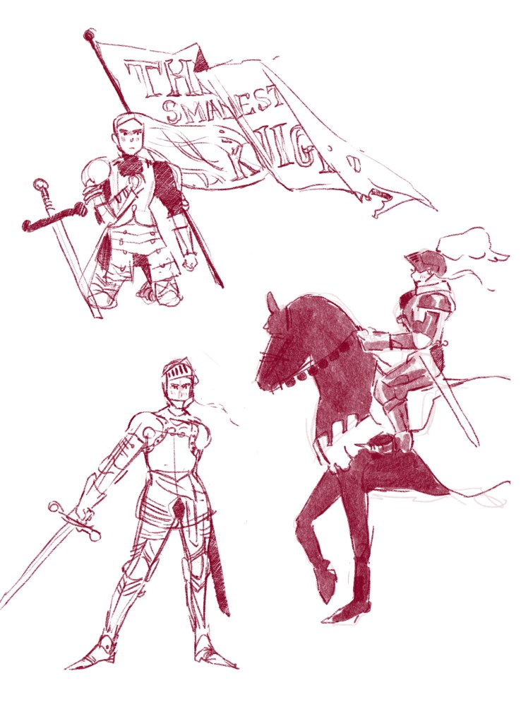
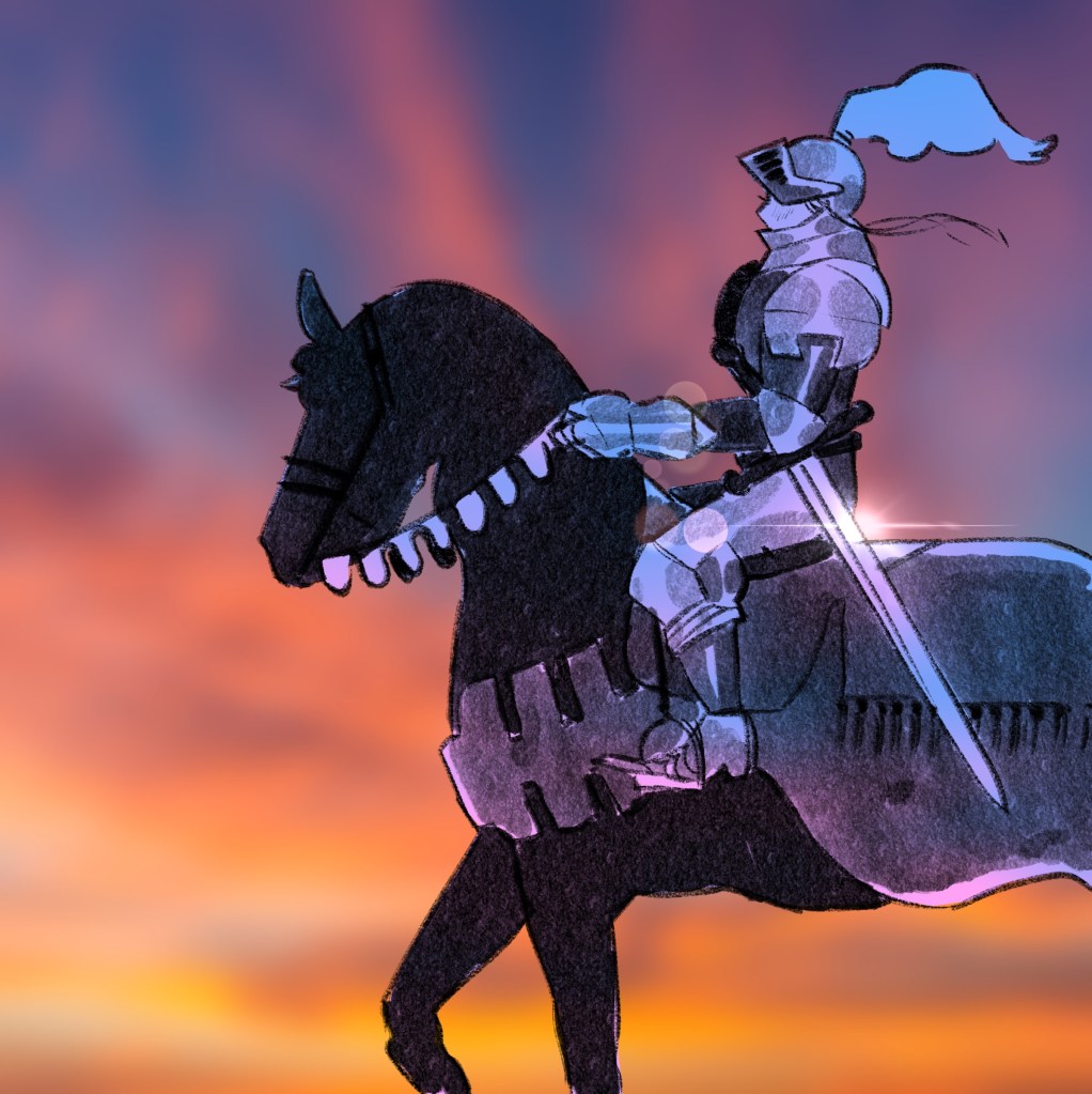
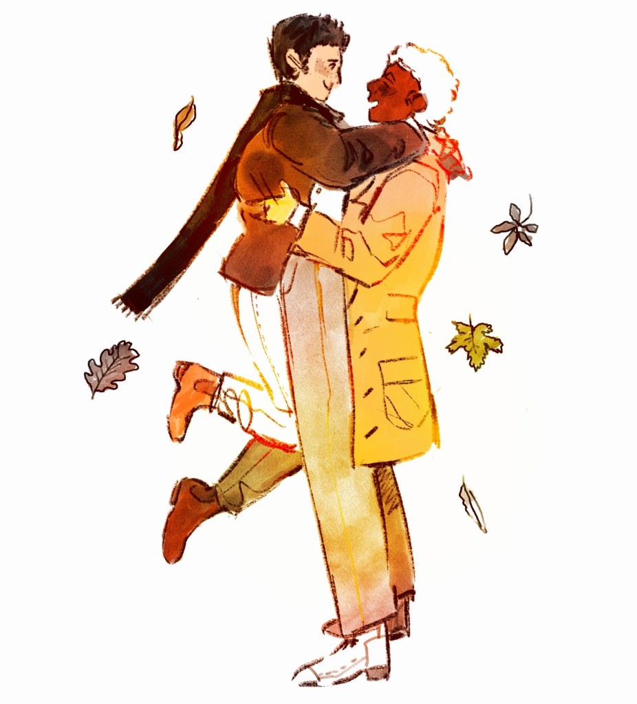
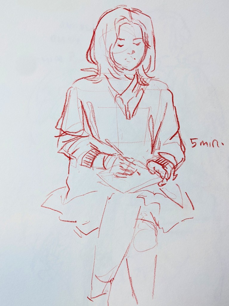
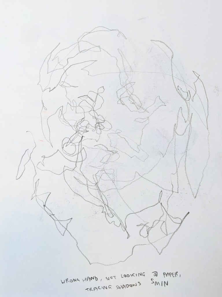
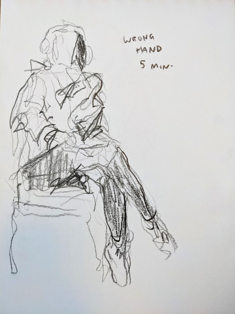
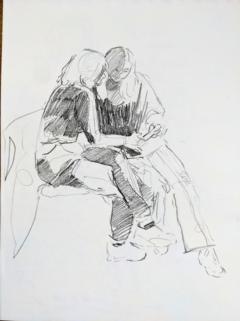
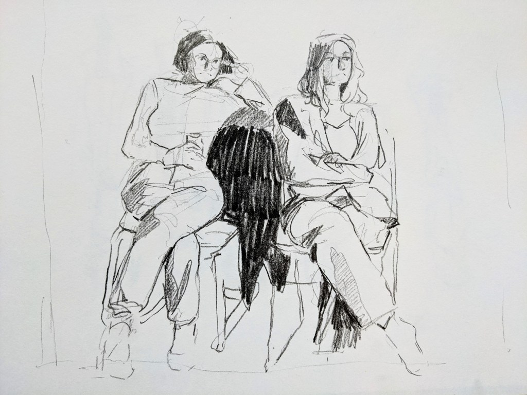
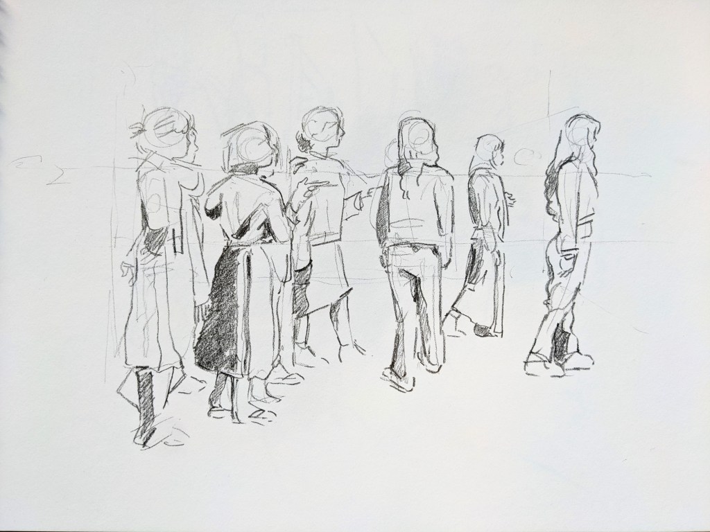
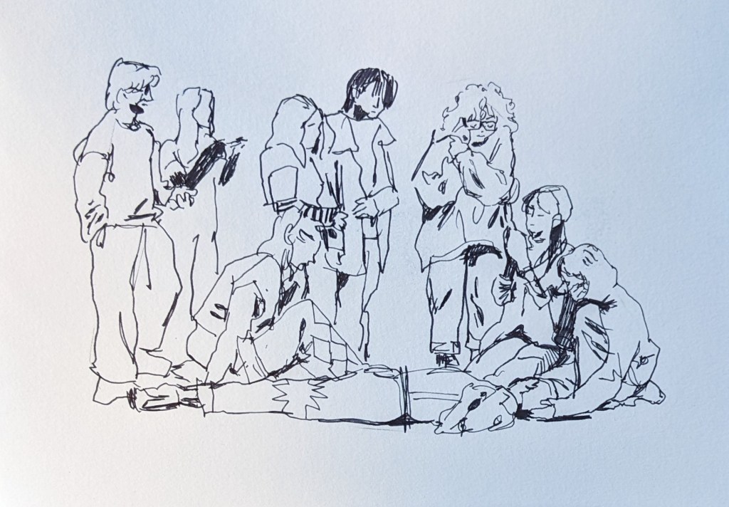
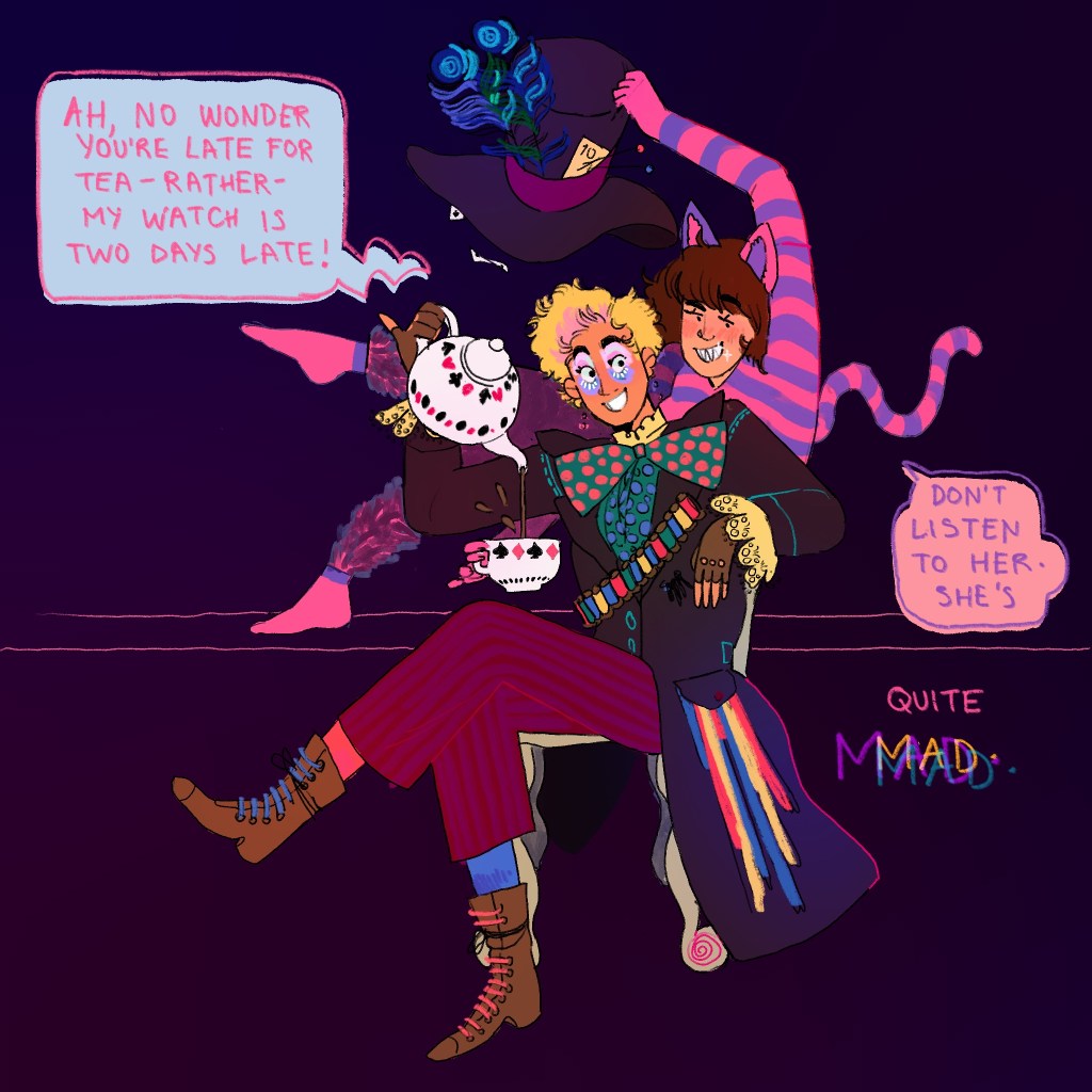
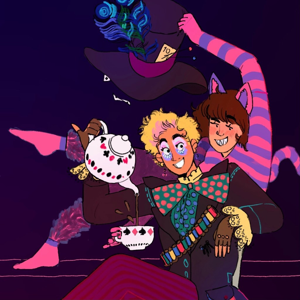
Sat down after a couple solid hours’ housework to draw Drake and Antonia in their classic halloween outfits. Did warm up drawings of the view out of my window to get my eye in and scribbled a bit to loosen up my hand. Found a good reference and made a good sketch.

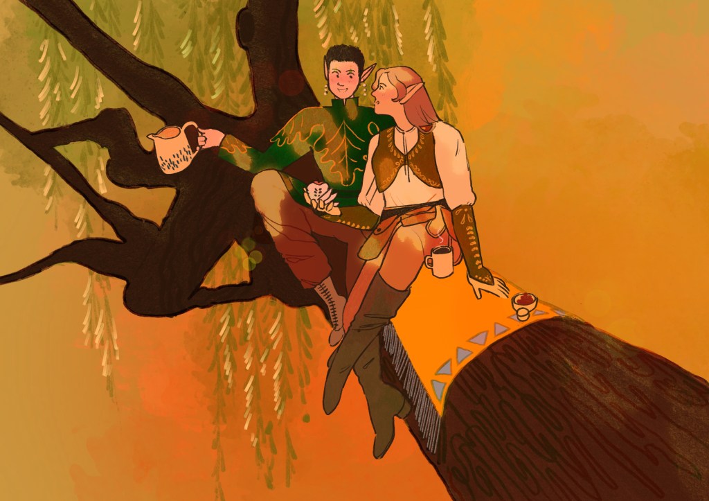
But when it came to taking it any further, I literally could not get the drawing to sing to me. I tried changing the pose, going back and editing the sketch. Drawing tightly and drawing loosely. I realised halfway through I didn’t even really know what I wanted.

I skewed my attempts out just to showcase them.

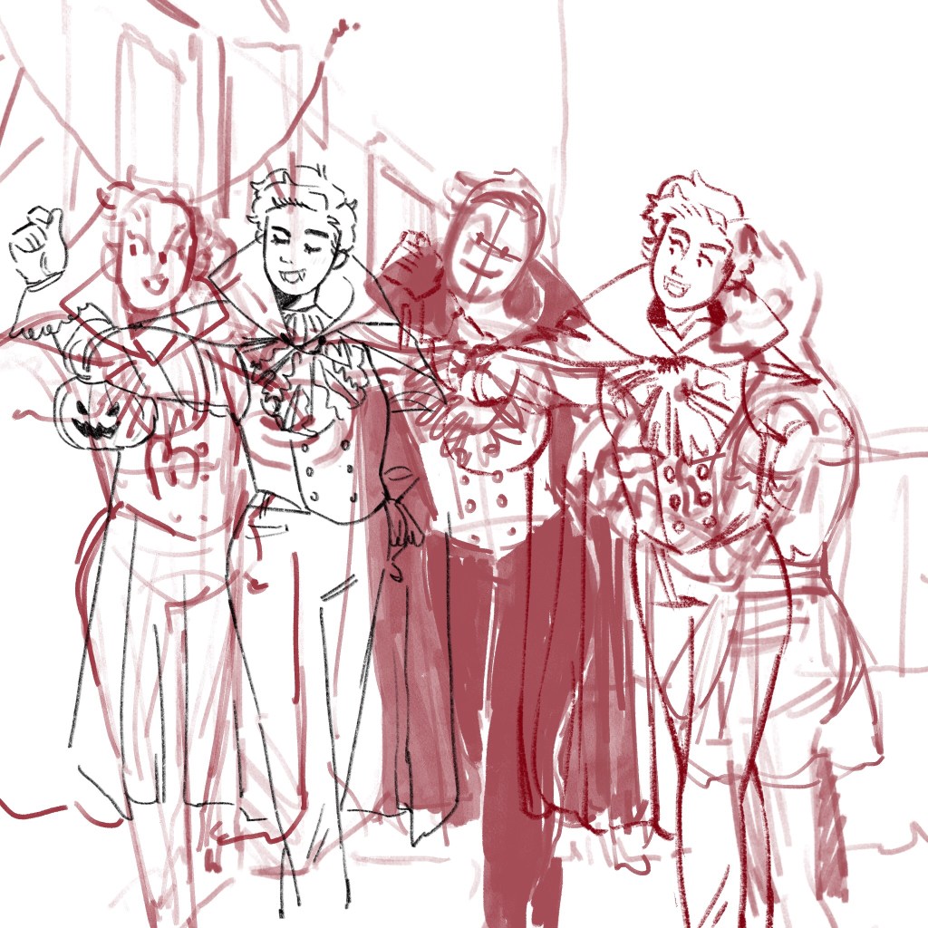
I’ve given up on it and am now documenting it. I think I’ve been getting a lot of feedback so fast from tutors, and all this new stuff we’ve been doing, I’m overwhelmed.

Comforting myself with the hope that my eye is actually getting better than my head and hand, and I just need to catch up and reconcile everything before – inevitably – reaching a better informed, cooler level of art. After a summer of prolific work I’ve been really proud of, though, this SUCKS.

Drawing Workshop – Hands

Taking a look back at why this was so successful, I see vividly what Jeremy was saying when he talked about the most intense part of a shadow being the edge. The middle two fingers have a nuance and depth the index finger lacks.
This was an excellent opportunity to tackle drawing the spaces between the fingers, acknowledging the depth of the hand and not losing any elegance with foreshortened fingers. The problem to be solved is forever: how do I make a foreshortened finger not just look like a stubby, shorter finger? And I feel quite happy I’m creating planes and tones to indicate depth.
This was the ten minute sketch to be carried out while hands move. This was a fab challenge and I’m pleased that Dani committed to a good activity that needed her attention – I noticed some very inattentive or lazy movements that wouldn’t have been nearly as enriching to draw.

A Short Stay in Hell: Full Zine

Click HERE to view the full art-directed zine taken from Gabby’s original.

Once you’ve taken a look at it, come back here.

This is a very small version of all the pages together, to refer to if you’d like while you read my notes.

NOTES.

The narrative that started speaking to me in this zine was one of walking into the office – a very curated, clean space. I see the office represented graphically with the hard frames, clean edges, flat colours, contained imagery on white. It is quantifiable, processable information in your little mortal brain.
Here this takes the form of the first three spreads being highly curated – high contrast shapes, taken out of their environment, and put on a pedestal for the zine reader to view and take in.

On pages 6-9 there is experimentation with full bleed – pages 7 and 8 both have elements that hit the very edges of the page. To me this represents starting to get a grip on the true atmosphere, realising something is wrong, a loss of control.

Pages 10-11 feature a full-bleed double page spread which is clearly sinister. You realise suddenly you are in danger, the demon is watching you – perhaps this illustrates the moment where the lava hits the window behind him and your focus changes. You see that you really are in hell.

The second half of the zine is mixed. You are greeted in turn with highly atmospheric, full bleed images, or slightly-curated images in frames. I vividly see you sitting in the office, unsure of where to look, trying to keep a hold on your sanity – but becoming overwhelmed as the images of hell in the window behind you seep through.

Of course, that’s just my reading of it! It’s funny how in the first zine I was sure I was a guardian angel sitting at the table, but Gabby’s zine is that bit more sinister and personal. Now I’m sure it’s my soul on the line.

For fun, I think I’m going to make a little form based on my creative writing from earlier.

Women Drivers…

This one is a mixed bag, but I learned a lot from it. Trying to colour tonally and THEN colour as well as that seems to dirty the piece overall. I’m going to have to take my skills one step further and simply pick tonally correct colours to complete the composition, which I look forward to!

Composition and expression wise I’m pleased as punch with this – I got the air right for October, I got the tension in techo’s hand, I got the nuanced guilty-but-still-laughing look on Drake’s face. This was a mixture of reference, thumbnailing, me looking in a mirror and making silly gestures and imaginative work.

Nieves.ch explorations

I was sitting down to work on my zine – I’ve actually started referring to working in my head not as work, but as “Fucking around and finding out” – and I hopped onto Nieves.ch to take a look at some examples of good and interesting composition.

Look at the weighting on this… the circular frame of the disco ball, and the empty space at the bottom left. I could curl up in that negative space and take a nap while the disco ball spins.
I could actually eat this spread. The way the white works, and the exact shade of desaturated lilac on the right – this sings to me.
Look at the diagonals here! This artist was really interested in language and readability, and the figure here almost literally makes a letter X. Even the barcode adds to this page in my opinion.
I keep coming back to this page! The gesture of the suited man so perfectly works with the offended, squinting house, but I didn’t even see it as a face the first time I saved this photo. The monkey makes a fantastic shape.
The smoke almost being pressed into the top left corner by the composition gives it a doodle-y, playful feeling to me.

I particularly liked Perks and Mini’s 100 page photocopied zine. What they manage to do, and on the yellow paper, has really interested me. The next zine I make, either for uni or personally, I’m considering in working with this black and white on colour paper style.

I am making pages upon pages for the zine, and hope to selectively choose the best looking ones and ones that work well together at the end. Right now it’s fucking around, and finding out.

The Littlest Knight

Did some sketches of Techo to get an idea for a lovely clunky Knight with some good shapes. I actually had an illustration by Chris Riddell in my head when I drew, from last year’s ditching trip, of a knight on a horse.

You can see I chose my favourite image for composition and worked it up. The black horse frames her, and I think having a huge horse gives her scale as such a small Knight, which is the point of the illustration.

I loved using the gloaming brush quickly and expressively to get those shiny tones on the armour and creating shape. I put a pale blue pin light solid layer under her and the horse, and I think it gives her a wonderful quality that also means it interacts with the sunset in the background and places her within the scene.

Important to note that I was actually working this illustration up with a technical pencil and I was getting frustrated because the mood wasn’t coming across. I switched to a more expressive chalk brush, and still wasn’t happy, but then I made the brush a LOT bigger and started working faster and more expressively. That’s when I got the feeling I needed to transplant from the sketch.

In terms of working quickly and coming back with a really effective illustration, I’m really happy with this. The lines and colours are inspired by my drake and Ludwig in autumn image, which was me going totally experimental and creating something hugely successful in my opinion.

Martha’s Gift – Elves and Food

For Martha’s birthday I drew us as Elves, an image that’s long run between us due to our love of LOTR and exchanging simple baked goods.

With as simple a background as possible, I really wanted to get across the leafy, green and orange, autumnal feel. I’ve always associated Martha with these colours.

I think this piece is really successful. There’s a density to the air that suggests sunlight on dust, and life. I focused really hard on keeping tonal plains simple and pleasant, so that when I threw colour on, it was still readable as an image.

The tree and poses are referenced but I chose them because the tree branching into the foreground gives a great sense of depth and creates a scene the characters sit within.

She’s in Japan right now, and I miss her.

Drawing Workshop – Groups

Absolutely amazing drawing workshop today. You can track so clearly how my eyes and hands warm up.

Really interesting talk from Jeremy about how figures can be tied together, made to sing and work together. Similar objects of attention, similar lighting, interacting poses, creating this sense of oneness. I loosened up throughout the session and could actually feel my eye working things out and understanding.

I am enamoured with this one, actually. I can place the nose, the eyes, the earrings. Working slowly and considering the line has made something really special.
This was the one I was happiest with. Creating a vanishing point and an impression of the room really helped me situate people in the space. I feel like their pose was a little more lukewarm than our cool “dying person” scene but I still feel like this is dynamic and directed.
This was Eizen’s drawing of me as a little casualty. I am going to stare at it for five hours.

My Watch is Two Days Late!

I had this idea when I worked the Wonderland Ball at the Grand, a very luxurious charity event decorated to become wonderland.

There were many actors who greeted the guests, such as an Alice with her looking glass who asked if I was a henchman for the Queen of Hearts (we were obviously staff). I have never been more in my element in my life.

The mad hatter stayed impressively in character, and he really was batty. The Cheshire cat was a contortionist. Seeing real people (theatre kids) acting wonderland characters made me think of Antonia and how good she’d be as the mad hatter. HOW haven’t I drawn her as him before? (Spoiler alert – I almost definitely have and have since forgotten).

Next time I’ll work on a bigger canvas.

Really pleased with the background colour and tonality of this piece. I love bright colours and I appreciate that it complicates things when trying to keep a piece coherent. Luckily, I did go for a slightly oversaturated chaos for this one, and tried to keep my colours in the pink and purple side of the spectrum.

Loving October and Halloween costume inspiration month.

“Open Work” Notes

Typed up from my notebook.

Umberto Eco – philosopher and semiotician. Italian, b. 1932.

“Encyclopaedia” – the transfer of meaning through signs.

Eco sees art as a performance because each reader finds a new interpretation.

Information theory. The amount of information contained in a message depends on the probability of the reader’s already knowing the content of the message before it is received.

Contemporary art dismisses semantic convention, less predictable, therefore contains more information. Not necessarily more meaning.

Conventional signs carry more distinct meanings, e.g. a stop sign.

Info also changes depending on the probability of the source, e.g. an xmas card from family vs an xmas card from the secret police.

The amount of information contained in a message depends on where it originates and on its probability.

Is the work legible – how do we stop it descending into a chaotic visual noise or a complete communicative silence?

Anything can become an artefact once it has been framed.

Underlying intention distinguishes art from randomness.

Open work in the visual arts is a guarantee of communication with added pleasure.

Openness is pleasure. World of possibilities.

Design a site like this with WordPress.com
Get started