Performance Project – Zine Articles

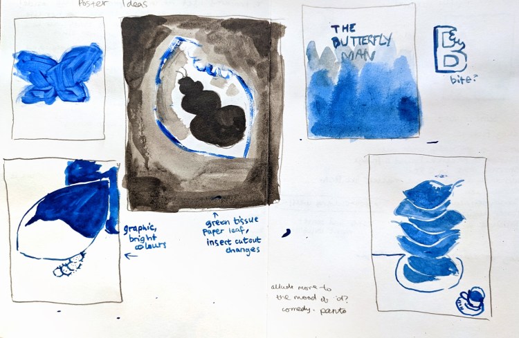
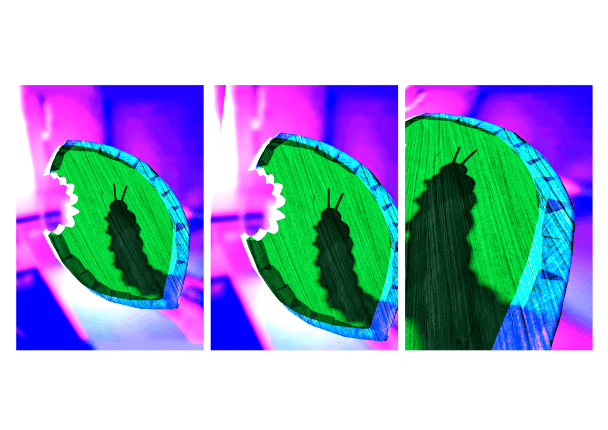
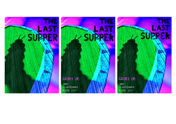
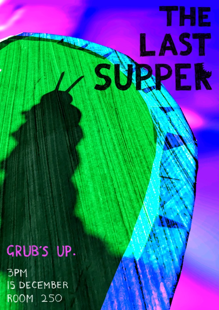
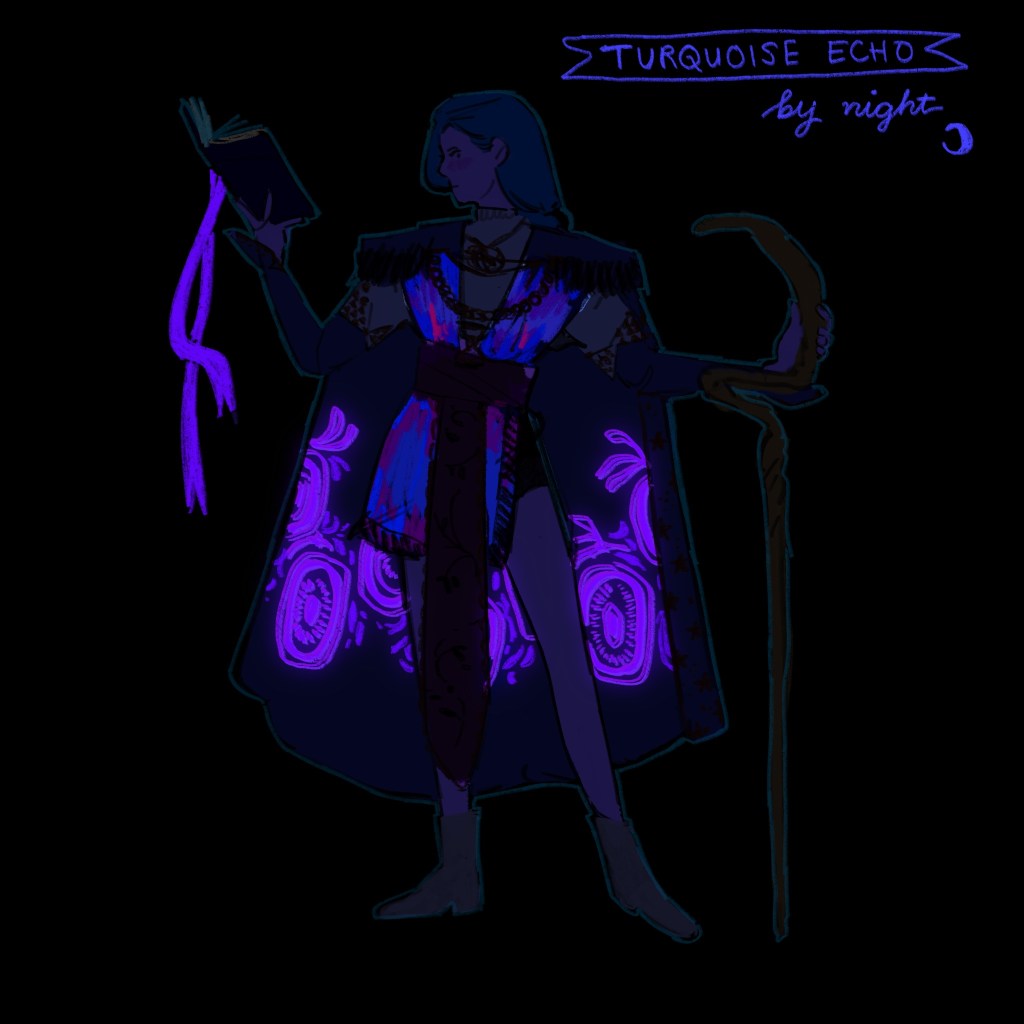
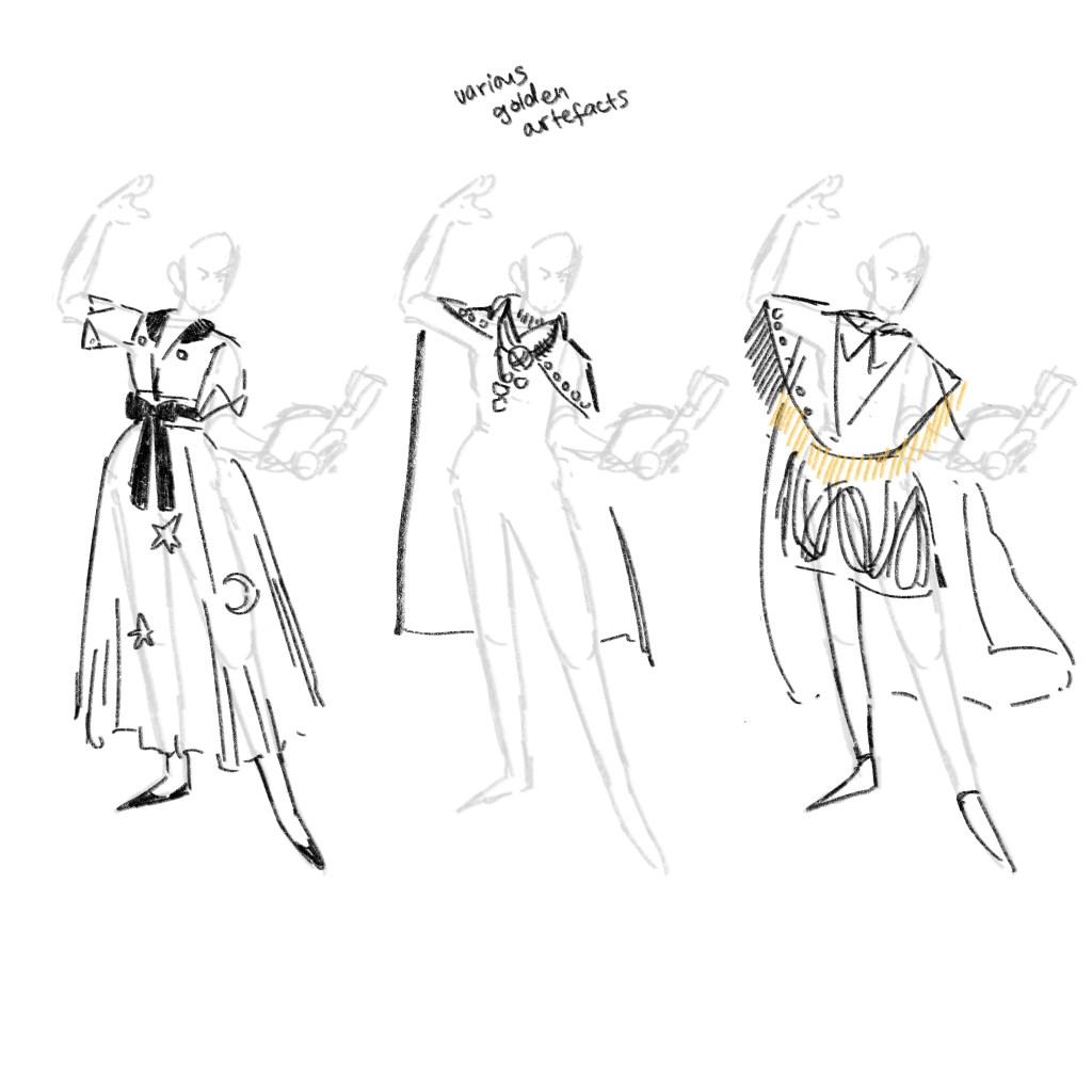
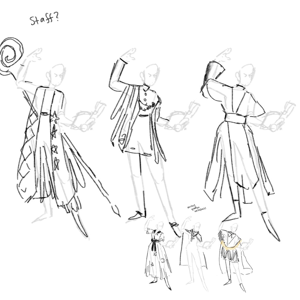
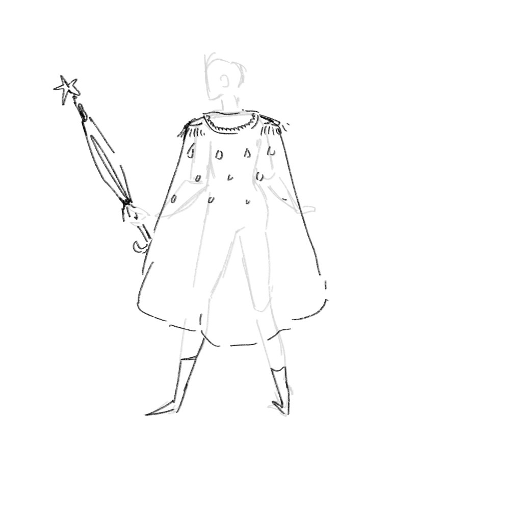
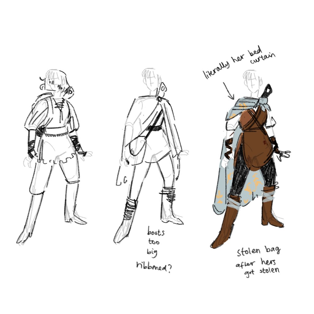
Below is the content I’ve written and drawn for Niamh, who is directing the zine for the production.

AN INTERVIEW WITH THE BIGGEST CATERPILLAR

By Sally Silkworm

As a senior editor here at Mos-Jito Publications, I never thought I would have an opportunity as rare and lucky as this: to sit down with Mr Ornithoptera Goliath himself in an exclusive interview. What makes this monumental caterpillar tick?

The bar is buzzing with life, and all types of insects have crawled out of the woodwork to get a drink this evening. What do you expect after the afternoon’s refreshing rainfall? I notice as I sit down with Mr Goliath that many pairs of eyes – often belonging to the same creature – were laid upon us. Goliath seems not to notice: he’s clearly used to the attention and fame an insect of his stature attracts. We get some Buzzweiser – the round’s on me, as he’s too busy eating to order – and settle down for the interview.

So, Mr Goliath, it’s a privilege to speak to you. I’ll start simple – where are you from? Where do you call home?

[Mr Goliath shovels fresh fistfuls of leaves into his mouth and avoids eye contact. I can tell from his wistful gaze that wherever it is, he holds his homeleaf dear to his heart.]

Simply enlightening. Next – and I’m sure our readers are all aching to know – what has been difficult about your newfound fame? All this attention must have its drawbacks: maybe you lost the girl you loved as you rose to the top; maybe you became estranged from friends and family?

[Mr Goliath doesn’t pause eating to answer – utterly typical, simple, showstopping. I fancy from a particularly loud chew that underneath all that glorious fat lies a hidden, tortured soul.]

And Mr Goliath, what sort of leaf would you say is your favourite? Do you go in for brand-name buddleias, spicy nettles, or the cosy, homely taste of bramble?

[No verbal response from this caterpillar celebrity, but his muteness speaks volumes: this is a caterpillar uninfluenced by sponsors or product placement, who would never sell out.]

That’s all we have time for, Mr Goliath, but it has been an absolute pleasure.

What a mysterious, handsome beast!
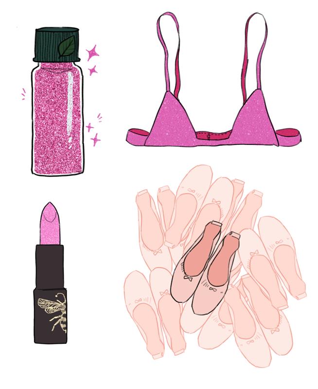
WHAT’S IN MY BAG?

WITH Zizina the Caterpillar

PINK GLITTER

I love to accessorise! Here’s my advice for any aspiring fashionistas out there: sprinkle some pink glitter on your leaves before you eat them, so beauty can be inside AND outside you!

SPARE BRA

Always be prepared! My bra straps are so thin that a particularly big brunch can snap the straps right off. This bra is from Marks and Pincers – my go to for affordable, replaceable fashion.

LIPSTICK

I like my lips to be kissable at all hours. You never know when you could meet your dream guy! This lipstick is in the shade Look of Love  from MayBeeline.

85 PAIRS OF BALLET FLATS

I keep spare shoes for those long walks home from the club when my high heels won’t stop hurting. The change is nice, but I need a whole separate bag to keep so many SHOES in. First world problems, am I right?

Performance Project – Poster

Right at the beginning of the project, I made some thumbnails for poster ideas and took some photos using lighting, silhouette and painted newsprint.

These are some of the images I took with no filters or editing. For coloured lighting, I set my iPad to max brightness and just showed colour screens of either green or pink.

Today I sat back down and let the process lead me. I will show the process and make some notes. Please note that the images are small and low-quality as this is just intended to evidence process, and a high quality final is at the end.

I started by darkening the background and altering it in different ways. One of my overlays on a mad colour dodge layer created this highly saturated look, and I thought it really suited the rainbow, pantomime mood that the production has taken on. I enlarged the leaf a little and the edge begins to interact with the dodge layer, creating more visual interest.

I experiment with distort and crop to create some different compositions. I did more than just these, trying it on the other side and playing a bit more with colour. When I went back through the images with fresh eyes I thought that the heavily distorted one on the right was strongest and most interesting at first glance.

I thought the font Rory used on the official poster was strong, and went for a similar one. This is a square, thick, evenly weighted font. I think it works because the poster is so saturated and wacky that simple black text is best for grounding and legibility. I then resized some of the text and played with placement of details – I didn’t catch pictures, but legibility was worse if the details were placed on the right hand side as the vertical leaf’s edge cut through the text. The pun… well, I like to think I struck a balance between zany, funny and surreal, like the performance itself.

I love the character of the silhouetted caterpillar here, as it leaves a little mystery, and the lighting mimics sun coming from behind a leaf. The silhouette also follows other show poster conventions, as I saw from my research and collecting examples on Pinterest.

Visual Diary – Get Thee Back!

This was a JOY to make. It was a chance to really sit and focus and develop my idea development, if you know what I mean. Taking nothing, making it into something. Someone show Phil Tyler this.

I realised at this point that I had this specific cape in mind, so worked from the back fro a moment to get my shapes down. All of the previous designs could be said to be successful, but I needed my shape language to work for this character. Heavy on the rectangles, giving her a sense of presence. This is particularly important because Techo is about four foot tall in this universe. You heard me right.

Rectangles work for her because she is the rock of the group, and has it pretty well together. Her magic and skill is based on study and hard work, application of knowledge, brains. She’s reliable and confident in what she does.

The tight waist gives us an idea of her real figure, as well as the hourglass shape mimicking the hourglass she wears around her neck as a magical charm. She’s flat chested, but the wide shoulder pads tapering in give the illusion of an hourglass. She’s got that short skirt and shorts because of all my characters, she’s the one out on the pull most often. She has to think practically about these things!

I love that at this point, you can absolutely follow mannequin by mannequin what shapes you can see I thought worked and what shapes I changed, leading up to the final design.

A moodboard-type thing I threw together quickly for the colour palette and for pattern inspiration.

Visual Diary – KIDNAPPED

I can actually evidence the work I did for this one.

The pictures are uploading on drive, so let’s fill this time productively. How was your day? Mine was fine. I had a bath, but I’m worried I overheated the shower unit trying to fill it. It would only be the landlord’s fault for giving us a water tank so small it filled up two inches of bath. I’m falling asleep at the computer right now because they say baths are good muscle relaxants. Ah, my images are ready.

I’m quite happy with this one, but I know it could be pushed further. The upper chest area is too big, the lines not quite as dynamic as they could be. I did a few iterations of the final image in ink, but bath-related sleepiness means I can’t get my book out and take a good picture.

I will say that I like the traditional art. The photographed nature of it means the paper texture adds to it, which makes it look like a real missing poster. The portrait isn’t a photograph, but a royal portrait, which will have been “airbrushed” to make Mitzi look more beautiful and regal than she really looks. This is to Mitzi’s great advantage when hiding in plain sight once she cuts her hair.

Visual Diary – Could it be… her?

I have pages of sketches for this, but you’re going to have to take that on trust.

Absolutely CHUFFED with this one. The lighting, depth, composition and colour are all things I’m utterly proud of. Not to mention CONTENT: Antonia finds Mitzi lying asleep in the woods. What on earth is a young lady doing sleeping in a bush outside of town, so ill-equipped, so dirty, shivering? Antonia pauses and watches her sleep for a moment, before reluctantly unfolding the WANTED poster for the kidnapped princess and comparing the faces. If her suspicion is confirmed, this girl could be the bounty of a lifetime.

What started as an annoyance – a visual diary project – has become a delight – an excuse to submit stuff officially – stuff I would ABSOLUTELY be making anyway. And have made anyway all my life, and has always slipped by sidelines.

Visual Diary – Th-That’s Cheating!

Check this shit out.

This image couldn’t be without the pages of design I showed in the last few days’ work. Note specifically this page, where I get the image down a couple times for composition.

One big thing that I noticed was that I changed the size of the brush I used for effect. It gets bigger and slightly more diffuse for Antonia in the foreground, and we see it’s dark and crisp for Mitzi – who is the centre of the visuals. oh, FUCK! I’ve not drawn her arm in the hole of the sword. And I looked at that hole for ages wondering what was wrong with it. Ah, well.

This brush is an altered version of gloaming. I took out a lot of the size sensitivity, so we get slightly more consistent lines. There’s a very slight stabilisation and reactivity in it, so it’s slightly more bouncy than HB pencil. It’s also a lot crisper and more flexible than HB pencil, which has all the world of benefits but does also only make work with one effect.

Bear with me while I throw the process video together for this, because I really am immensely pleased with myself.

Visual Diary – Lyra Cassiopeia

Heir to the Cassiopeia Throne.

Here is the art followed by some of my writing for this, which goes hand-in-hand. The practice is really less illustration and more “I witness my characters doing things in cinematic 4k technicolour in my head and record it any way I know how.”

Gideon Clearsky is giving Hamish from the Alice in Wonderland film with Johnny Depp. Hateful, entitled, unfortunate beliefs about women and their place. Even if Lyra is a literal princess, and he is marrying upwards.

I’m going for a sort of cinematic simplicity with the plots – everything seems to go wrong for my characters at once, (give me that sweet disrupted equilibrium) and their meeting each other and mingling will change their lives forever (never heard that book pitch before, gemma.) Ah, but it’s different this time, because this time it’s these guys, and you’ve never seen more alive characters. These fellows climb out of the pages and then you really are in a sheriff’s office, watching Techo hand in a bounty through Drake’s eyes.

I am rubbing my hands together like a little fly on a window waiting to design techo’s wizard outfit. Oh BOY.

Performance Project – Day Four

Three big things happened on this day:

Firstly, I gave a big kick to the Instagram. I saw props and costumes being made in every colour of the rainbow, so I themed the feed with loads of posts featuring close ups that roved through the colour spectrum.

We also had two more videos posted on there – I think Tia did those!

The second thing was starting a Mantis costume. This means that I floated between groups a little, as costume have had issues with sickness and attendance within their group. It was quite a nice little passion project, though, because I am mantis, so I was making my own costume. It’s two extra arms, and while it was so busy I didn’t get pictures, I was caught doing a little dance mid-making.

The final thing was acting! The actors spent the afternoon rehearsing in separate rooms, and then doing a couple of run-throughs for the whole group. I can’t remember where I would have learned to project – perhaps in singing lessons? – but thank goodness I can. Watching amateur performances where people whisper quickly from their scripts despite all stage direction and encouragement makes me want to scream, especially because I can’t make out words people speak at the best of times. Of course, I know we’re illustrators and that this is one heck of a silly performance to be speaking in.

Visual Diary – Clothing Design

When I catch myself talking and singing out loud and bouncing around in my chair, that’s when I know I’m giddy with passion. Designing clothes has got me into such a good space recently. I just LOVE the pinterest and google research, and it’s really developing my drawing process. Before, I very often went straight in to a full illustration and designed on the go, which is fun, but drawing and designing has been fun too.

I caveat this by saying that going straight in usually makes the illustration part of the process, rather than a final outcome.

I was writing all day and when I realised I was googling fantasy currency name inspiration I knew i was back in THAT place. That place, baby, where saturation is turned up to eleven.

If you’re following chronologically, you’ll see the development here: you will also see some of these poses get worked up into a full illustration once I have a first pass of costume designs.

One of the big joys of this design process has been designing clothes that aren’t just in a vacuum – they tell a story. Mitzi is a runaway princess, and would have had to find clothes that didn’t make her look like royalty. She also makes poor choices – she tears her bed curtains down to make a cape, and the only boots she can find are one of the stableworkers’ – a man who’s many sizes bigger than her. She has to physically tie the soft leather shoes to her legs to keep them on.

She plans to buy regular clothes when she reaches a town safely, but her bag with all her money is stolen the first night she leaves the castle. Because she’s an idiot and doesn’t know the outside world well enough.

Design a site like this with WordPress.com
Get started