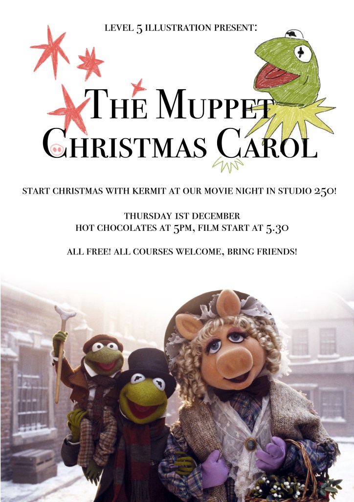
The first proper event we’re throwing as a group of student reps is the movie night on Thursday! I’m terribly excited about Christmas, and found some time to get a poster together for it.
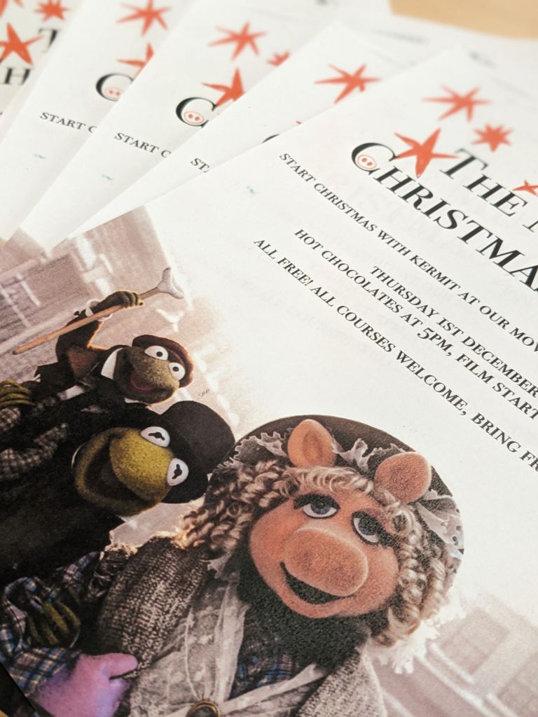
I printed one and then used Jeremy’s login to photocopy a few more posters.
I’m looking forward to it! If everything comes together on Thursday, it will mean the world to me. I love trying to arrange events on the course, and my last attempt was a big flop.
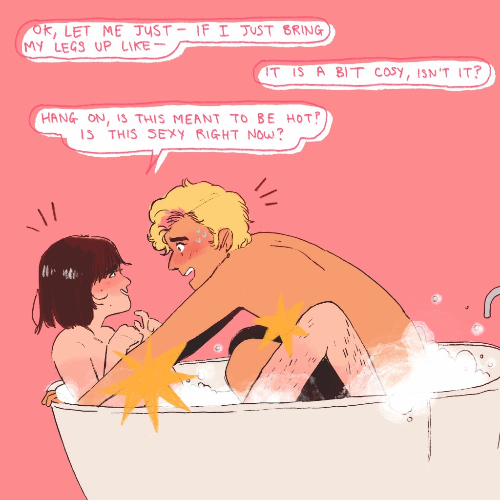
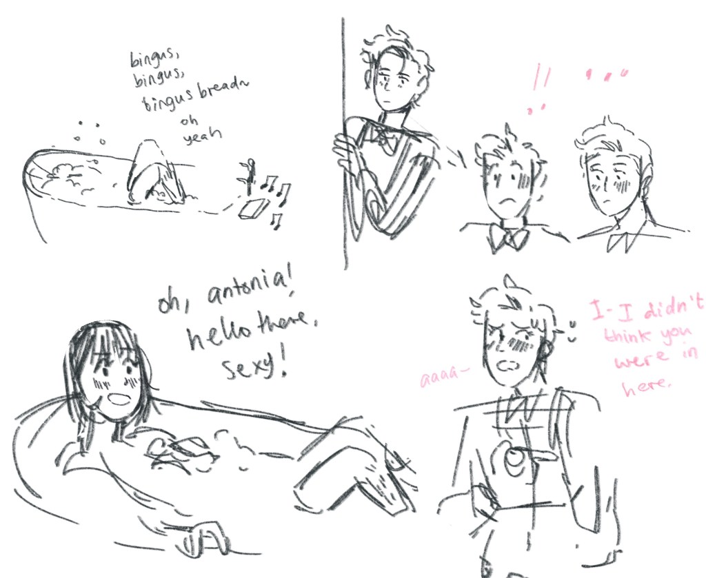
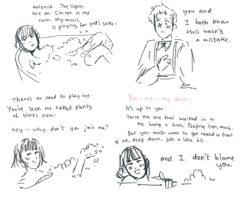
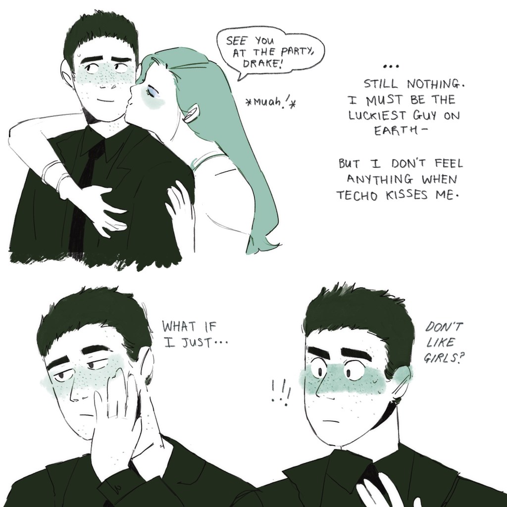
This image follows on from the bathtime scene I’m sure I blogged yesterday or the day before.
Antonia tries to be suave, thinking “sharing a bath is surely a sexy thing to do!” Anyone who has ever tried to share a regular bath in a regular bathroom with a partner probably did it once, vowing never to try that again. You’d need a hot tub, or jacuzzi, or a huge bath.
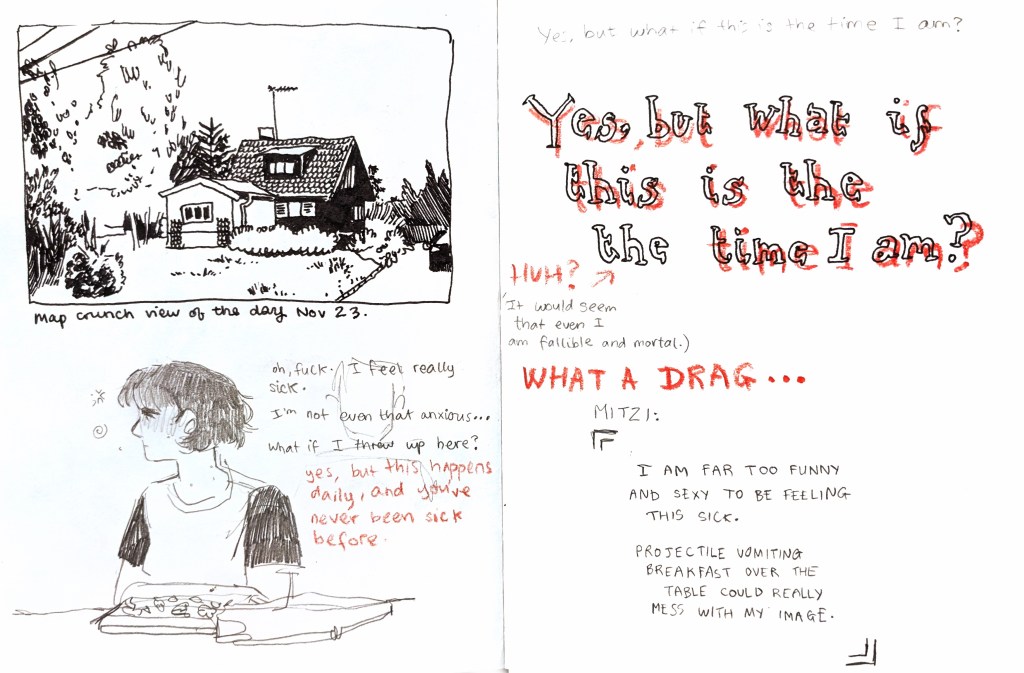
I struggle terribly with nausea. Every day I have to play the “will I be sick in public” game, which is really not fun. I’m never sick, but this is of little comfort to me in the moment. I’ve promised myself twenty pounds from my savings if I’m ever really sick, which, again, is little comfort. But it is SOME comfort. Anyway, here’s Mitzi feeling sick.
This weekend has been non stop with wonderful Christmas family activities. And minor surgery. At the end of the night, I JUST about had time to scribble out some plot before falling into a coma. Drawn to make thoughts be on paper, not to look perfect.
For context: Antonia and Mitzi have been together for a couple of weeks. Although they’ve done a few sexy things together, Antonia has been loathe to take off her bra or underwear. She’s transgender and conscious that her body doesn’t match up to how she sees herself and is seen.
After three of the most intense weeks of work I’ve ever done in my life, Damp is finished. And I’m so proud of it!
The overall mood in the crit was that this was a successful piece. Percy noted how effective it was to have Antonia as a brightly coloured digital asset on top of the desaturated, traditionally painted mould textures. This was great, as it’s what I was intending!
The sticking point was the “opinions” shot. The tone and audio both change at this shot, and it appears a little jarring. This makes sense – this was already a reshoot from the “green background” shot using these characters, but it was always a little incongruous.
If I were to go back and tweak things, I’d likely do these characters in traditional ink and boil them, placing them in the atmosphere of the video better. It was also mentioned that I might continue the “damp” ambience under their voices to ground the viewer, but I chose not to to create the sense of difference. I see why fresh eyes need that tethering to the video, of course.
Anyway, good project! I bitched and moaned like anyone’s business about this one but if it did anything for me, it’s making me take this degree VERY seriously. This past week I’ve been in full-time, 9.30-5.30, just sorting work. I hope to continue this habit, whereas before, I was only doing so much at the uni.
Working with moving image was already quite natural to me as I’ve worked with reels for months and animatics for years. To create a full story with a beginning, middle and end is always a task for me, as my mind roves and my hand is moved to create bittier scenes as I’m inspired.
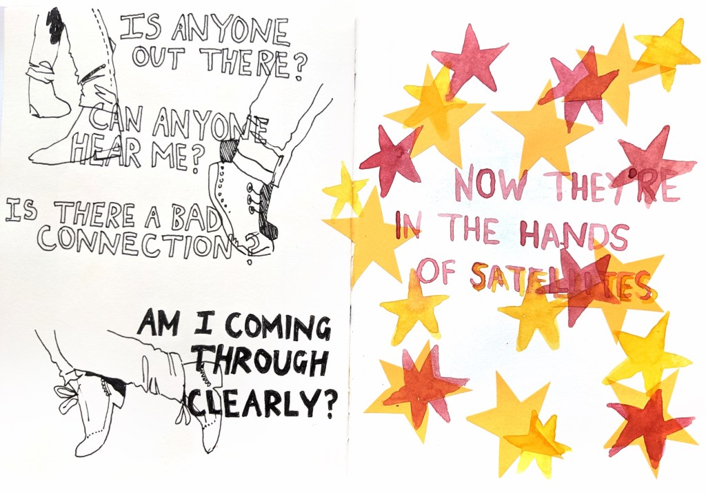
Whenever I listen to Data Loss by JKuch and Adam Tell, I always vividly see an animated music video of colourful legs wearing various laced shoes dancing, with fast cuts between the beats. The backgrounds change colour too. And in the second verse, I imagine the same images, but they’re increasingly interfered with and degraded by glitches and static.
I won’t have the time to make those animations – maybe at some point I’ll make up one or two shots. But the song came on while I worked in my sketchbook and I made art.
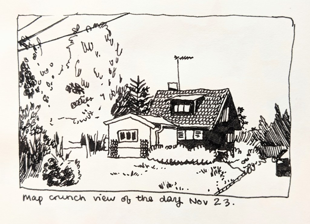
I should really preach mapcrunch to people. It’s a site that gives you a featured google maps view, and then you can get a random google maps view when you click too. It’s really good for practicing landscapes of all different types. (Admittedly, mainly roads, but I got a glacier once!) And because it’s a google map image, you can scroll around and zoom in and practice curating a frame too. Really good practice.
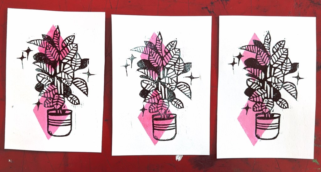
I wanted to run a quick print test, investigating whether a lino cut print would show up well on top of stencilled paint printing. I was dubious about this because right when I started lino printing years ago, I tried to hand print a two colour lino print. What I found was, the thickness of the ink on the page meant that the second colour wasn’t printing properly – probably would have benefit from a proper press.
Anyway, I used an old lino cut I’d printed of a fig houseplant, and quickly laid down some diamonds in pink sponged paint. I wasn’t expecting good results, but they came out really well!
This is hugely useful for me because it means I can print colour underneath my lino cut print now. This will mean the lines on top are crisp, and will make registration a little more forgiving than if I tried to stencil on top of a lino print.
K.E.Pedersen@brighton.ac.uk Kim Pedersen, Study Skills Tutor. Email for study skills tutorials
Glossary of words and definitions on the study skills site
Plan your writing – useful! “Personalised Support” lots of specific subjects, e.g. growth mindset, study habits, purpose and motivation.
General tips – enthusiasm and professionalism. Voice replaces body language. One slide = 1-2 minutes.
1 intro slide – obvious, simple, descriptive 1-2 slides key points from reading (2?) 1-2 slides descriptions of chosen painting (1?) 1-2 slides summarising findings and conclusion (2?)
state that the image is from the library in the image caption.
conclusion – restate the line of enquiry briefly summarise findings briefly give a clear final take away message direct them to the reference list / bibliography say thank you for listening verbally
So, I’m going to try my very hardest to illustrate the thought process that has led to my idea for a print.
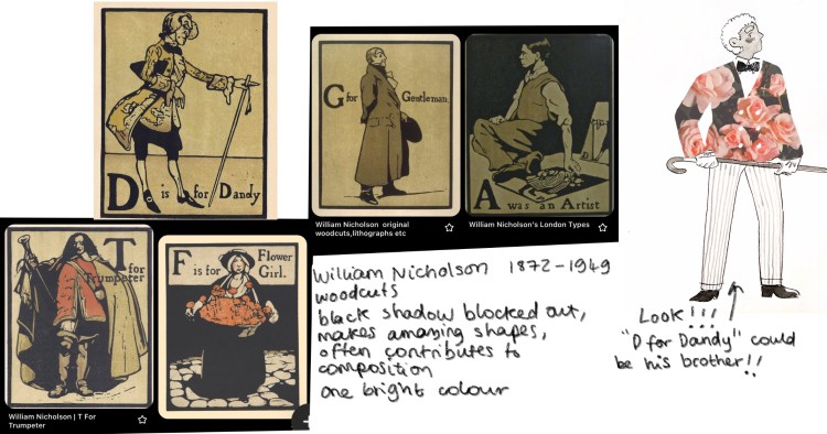
We start with some of my research, specifically William Nicholson’s woodblock prints.
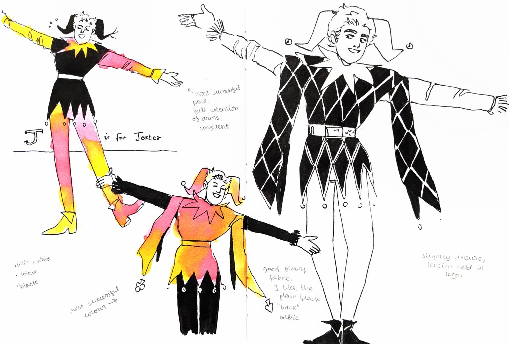
I was always interested in “D for Dandy”, thinking I could create a similar print but with different fashion I’m interested in. But I realised, I’d be really passionate about a J for Jester.
We can also use a bit of development that’s happened throughout the classes.
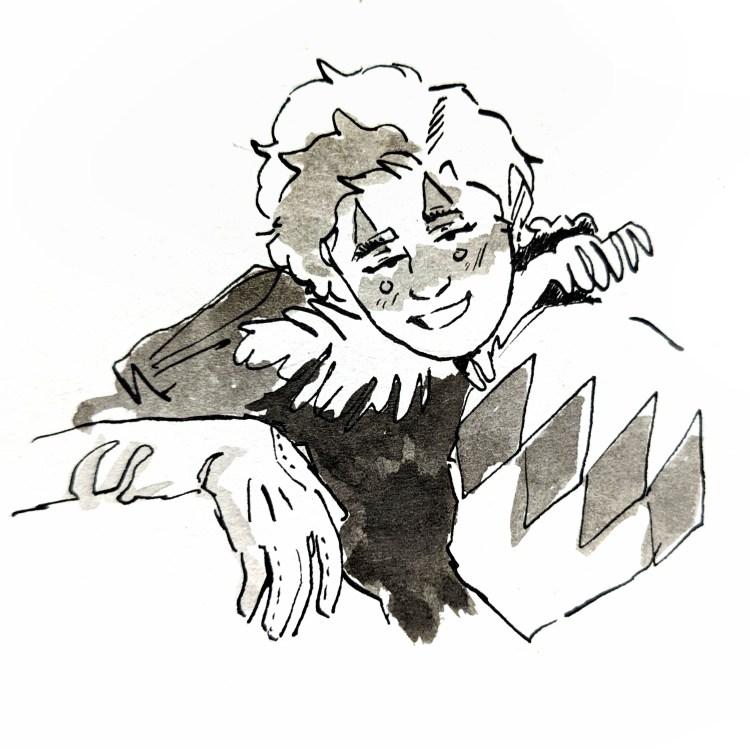
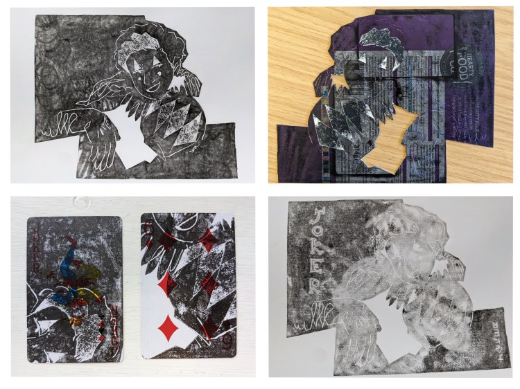
We start with this ink drawing I made earlier the semester, which inspired a series of relief prints.
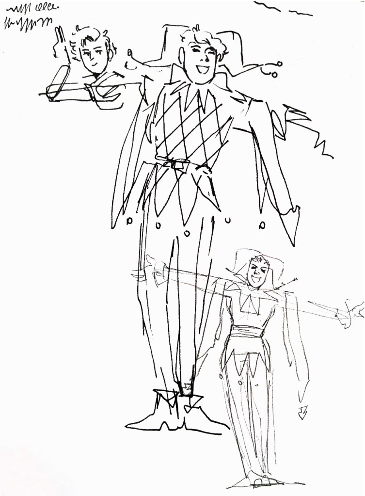
I drew some ideas yesterday, drawing on Nicholson’s images for composition ideas and a wonderful image of Danny Kaye at the end of the Maladjusted Jester too.
The next step is to thumbnail further, creating a few more variations of composition. I want there to be a nice, playful block of black in the back, and I want to keep the image readable. You’ll get what I mean when I mock up some digital thumbnails.