Damp – Project Moods and Colours

I spent this morning getting images together to provide a basis for the overall look-and-feel of Damp, outside of Antonia’s bright character.

I started with Mould textures, with the intention of creating some traditional texture inspired by these that would become the living, moving mould in the animation.

After that, I created a moodboard for the overall vibe and imagery of the animatic.

Using the two above resources, I created a few iterations of colour palettes.

Through my investigations, I realised I was drawing a lot of subconscious inspiration from the Horror video game, The Cat Lady. The game came out in 2012 and has been one of the formative pieces of inspiration in the back of my head forever, which is ludicrous, because the game is damp, disgusting, graphic and bleak. But I love this game. For anyone who follows my ocs, the name Mitzi was inspired by the main character Susan Ashworth’s friend.

Once I googled it, I realised that some of the visuals were near-perfect for the look I’m going for. The actual game spends a lot of time addressing and showing the bleakest living situations in cramped flats, so it makes sense that it would come to mind. I created a separate moodboard featuring the most useful atmospheric visuals.

Visual Diary – A Caucus Race!

I’ll exhaust myself with Alice in Wonderland eventually.

Forward, backward, outward, inward, come and join the chase!

Nothing could be drier than a jolly Caucus Race!

Forward, backward, outward, inward, here we go again –

No one ever loses

And no one can ever win!

Damp – Character Development

I was unsure about what sort of detail to go into with the character, but I’m letting intuition guide me for once. This is what my heart wants to do!

I took a look at the drawn characters from original Paddington, and through tearful eyes (he’s just so loveable, isn’t he?) I took photographs.

I like the black lines, and the way they move. They’re traditionally drawn, and my experiments were traditional – but I may have to make the character digital to save a LOT of pain in terms of overlaying her as a transparent asset.

Below are my experiments.

Looking at them now, I’m really responding to the pink and yellow one. I think it’s really bright, and that’s the effect I want to contrast the mental picture I have of the blue-grey room.

Antonia is a charismatic and energetic person, and I want to highlight that in her colour palette to show that these sorts of problems can happen to anyone. And when she loses her saturation at the end, the point I’ll be making is that getting stuck in endless legal loops and being forced to live in a place like that can just suck the life out of you. Anyone reading this may be wondering if I’m mary-sueing about my shower problems, and if I am, so what?! Call me Ken Loach for all these statements I’m making about society and The System.

Then I took an image of Antonia sitting on the bed and repeated it three times using my iPad as a really general light box. I overlaid them, coloured them quickly digitally to save time, and had a go at creating a boil.

The boil is quite harsh. Another reason to work digitally with the character is that I can trace directly over the images and get a more streamlined, less noticeable movement. I do also accept that I’ll be losing something with the digital images, so I might make my reference images traditionally, to keep that physicality and flowing hand and ink movements.

The next movements will be making some mould textures in my sketchbook, and pinning down the set. If I’m doing Antonia digitally, I might spend the extra effort on keeping the set traditional.

Storyboarding Workshop – Initial ideas and animatic

I took these images and threw them quickly into Premiere Pro, all the same length. I also put stormy weather behind it to get that slight feeling of wetness.

Let’s force myself to think critically about this.

What went well?

I think the opening scene is strong. The first shot creates a clear scene, and indicates that this is set in a basement flat, which is where you’d expect to find a damp problem.

I’ve had the imagery of water dripping down from a window frame clearly in my head since the animation class. And then we’re introduced to the room from the inside, keeping the window as the grounding feature – followed by a pan out, introducing the damp. The damp will be the only moving element of the image so it will be the obvious focus. We then see the title of the sequence – damp – and a definition.

The aspects that follow can happen in a less rigid order, but essentially introduce the character, situate them in this damp room. The poster going over the damp but falling off shows that our character is trying to make the best of the situation, but it’s out of their hands.

Notes from a chat with Jeremy:

He seemed to lean towards the idea of the character having a bit more … character. Now, this is GREAT news. We’re all thinking it, but not saying it: this character is Antonia. She has the damp problem. This is her basement flat, and her issue. If I can add in a little collar line, evidence that she has a shirt, her hair, her nose, etc. I might well enjoy this project more. My pitfall is making the characters too much the centre of it, but if it’s encouraged… hmmm!

Here’s an important note: this will be the first time I’ve actually used one of the characters in a project. Let’s see if it adds passion or takes away from the creative process. A guinea pig, if you will.

Narrative workshop – Parlour Games

This morning was a few exercises to loosen us up and get us thinking about creating stories, to work with our new brief Narratives in Motion.

Below are some of the real winners.

And secondly, the genre twist exercise: we were given a genre, and had to recreate one of the set texts in the given genre.

A Short Stay in Hell as a Sci-Fi Text

The Efficient Demon leaned back on his high backed, red leather hoverchair, then hovered away from the five terrified earthlings seated before him and turned to the spaceship control panel.

The UFO was well lit, with long incandescent tubes arranged in several functional pairs that spanned the length of the curved cieling, giving the room a soft, extraterrestrial feel.

The demon waws the only thing that did not seem to belong. The cyborg’s yellow gaze was directed mechanically out of the wide window that dominated the side of the UFO. Behind the glass was a huge, dying star going supernova.

He sighed and poured some WD40 on his metal clad hoof-joints as he surveyed the scene, all light and matter being drawn to its ink black centre. The heat from the atoms melting was almost unbearable and the demon hoped his system wouldn’t overheat.

The earthlings watched in horror as a nearby spaceship ejected a crowd of people from its metal hatch, leaving the victims to be drawn into the supernova and incinerated. One wrong move, and they knew that would be their fate too.

A towering mechanical hand made of metal grabbed the earthlings trying to escape and threw them efficiently into the molten centre of the burning supernova.

The demon hovered back around to look at the five terrified earthlings, wide-eyed with horror in his own UFO. They were dressed identically in Standard Issue Enterprise(tm) Jumpsuits and they were seated on brutalist metal stools designed for creatures with more padding than themselves.

Pottery – Three Glazed Mugs!

I nearly missed pottery today, labouring under the misapprehension that it was Tuesday today and not Wednesday. I said to Jamie that I really need a dementia clock on the wall, saying the day in big obvious letters. I did make it, however!

And I was so glad I did! WITNESS the three most beautiful single items you will ever lay your eyes upon!

From the second I threw that gorgeous little milk jug, I knew he was going to be my favourite. Everyone was obsessed with it, and so am I. And we held a tea party once I got home – and it pours, too! The fear was that milk would just pour over and down the side, but it works like a charm!

I stared at these babies for a good minute, then got right down to throwing. Unfortunately, a lot of my work was still waiting to go in kilns, so I occupied myself with new creations. I really have the technique of centering small amounts of clay down, and I’m getting my head around pulling with practice. My cylinders are coming out better and better. Below are the five I threw today.

They don’t look like much now, but that’s because they need trimming and handles! Trimming and a good handle completely transforms my pots. I seem to remember that my blue pot (now glazed, see above) was particularly ugly at this stage, and trimming and the round handle made it rather great.

Finally, I sat down with the slip bottles and decorated my red mug. This mug is small, so I think it would work well with espressos. Think … a shot of coffee the morning after gambling the night away.

“Place your Bets” was immensely and ridiculously hard to do, and I’m proud it’s legible. The slip bottles are nearly as wide as the rim of this little fella, and I had to peer in with one eye in the dark and just pray that a) slip was coming out at all, and b) it was making words.

Next week, I’ll see if I can get all these boys in for bisque firing. I find that going straight in with the glaze is quite lovely and effective, and if I can send them all to bisque, I should be able to come into the studio for an hour and get everything finished off on the Open Studio time.

“Open Work” Notes

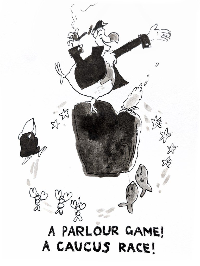
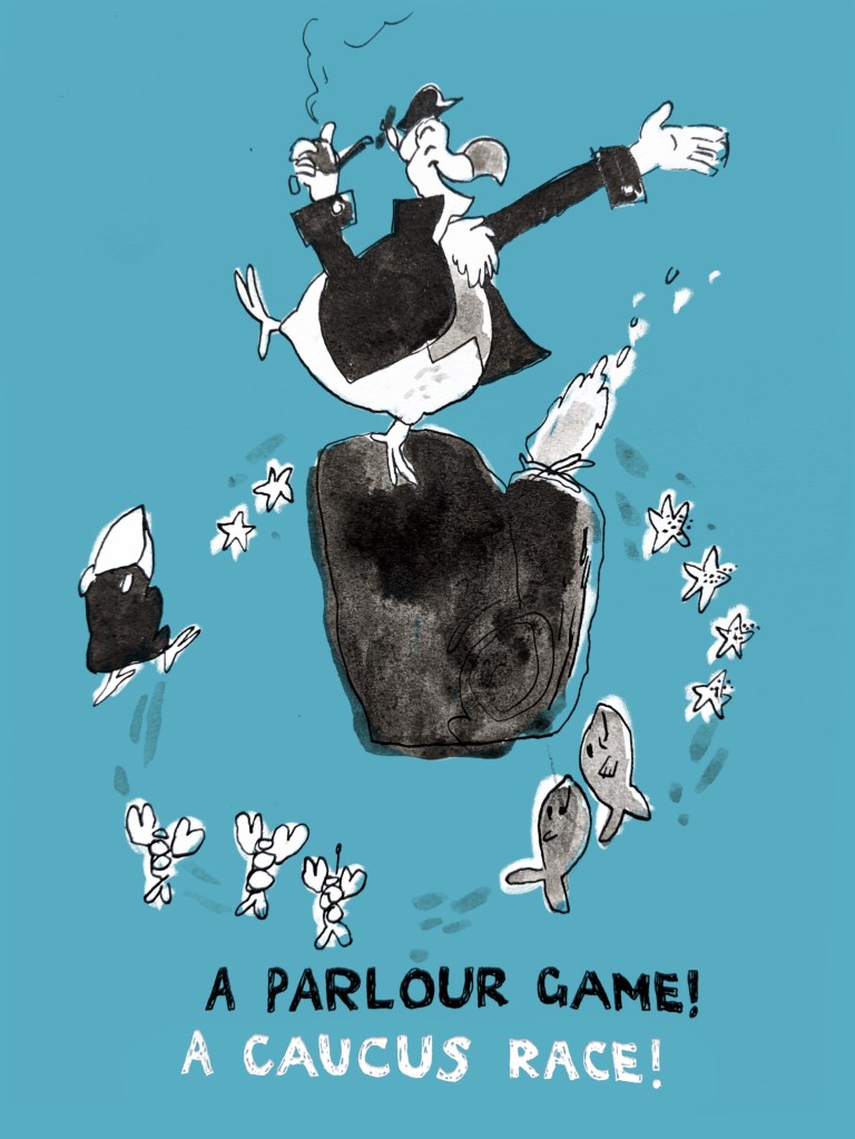
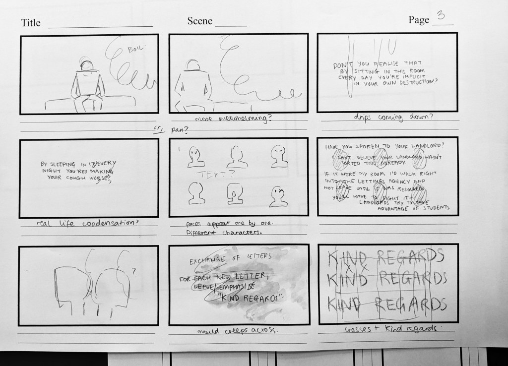
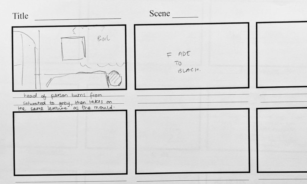
Taken at the Library on Wed November 9

A summary of “Open Work”

Crow, David. “Open Work.” Visible Signs: An Introduction to Semiotics in the Visual Arts, 3rd edition. London/New York: Bloomsbury, 2016. 165–187. Print. 

Crow describes and expands on the ideas presented by Umberto Eco in “The Open Work”, first published in 1962. Eco is a significant scholar in the field of semiotics, placing – quote – “…particular emphasis on the role of the reader as an important part of the creative process.” (Crow, 168)

Eco talks about the relationship between author and reader, where a reader uses their past experience to find meaning in a piece of work. Eco uses the term “encyclopaedia” to suggest the numerous readings that can be taken from one sign, that must be navigated through to find meaning.

“Openness” of work is considered in terms of how much information it has, and Eco used Information Theory to illustrate this. The theory states that – quote – “The amount of information contained in a message depends on where it originates and its probability.” (171)

The text considers open work in the context of the visual arts. He places a focus on abstract and expressionist art, with gestural marks that leave open many possibilities of interpretation by the reader. (172)

Crow discusses the concept of underlying intention being the discerning factor between what is ‘art’ and what is mere randomness. He highlights framing as an example of intention – that is, that any “piece of discarded material can become an artefact once it has been framed.” (177)

Crow finally discusses the pleasure implicit for a reader in decoding and assessing open work. He concludes that “openness is pleasure” (178), as the reader engages in a “game of pleasure and surprise, trying to interpret the intentions of the author as they do so.” (178)

(Dee, xii) “In a Mallarme sonnet or a Kandinsky canvas, the substance of words and of colours and forms itself becomes the starting point for constructing new imaginary spaces.”

Reynolds, Dee. Symbolist aesthetics and early abstract art. Cambridge: Cambridge UP, 1995. Print.

“Imagination, as I propose to use the term, involves experiencing according to a sensory mode of apprehension, but in a way which surpasses empirical knowledge.”

“…the transformation of the medium itself through the imagination of the receiver.” (4)

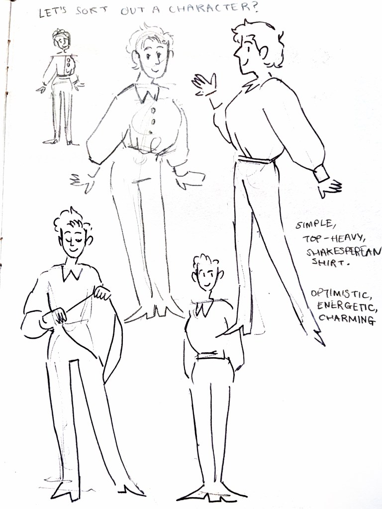
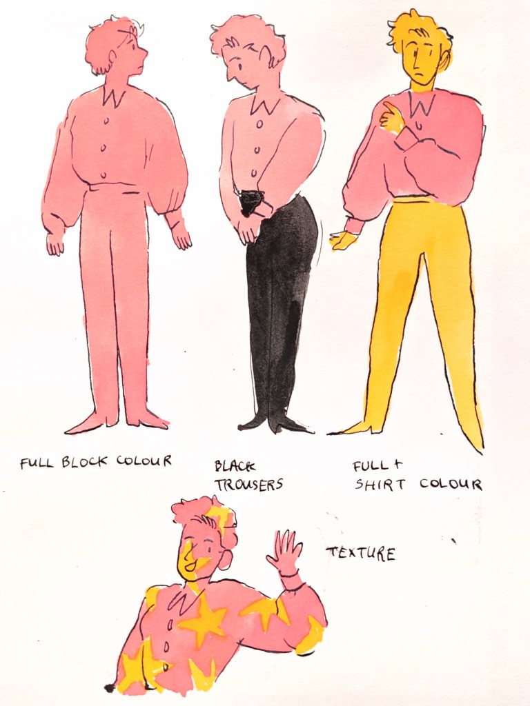
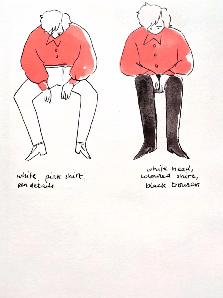
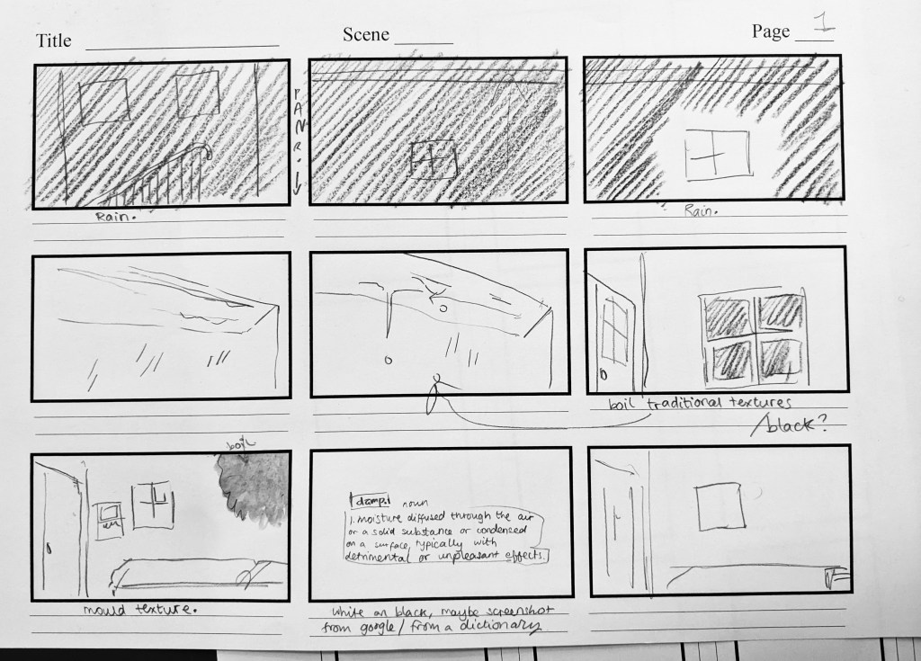
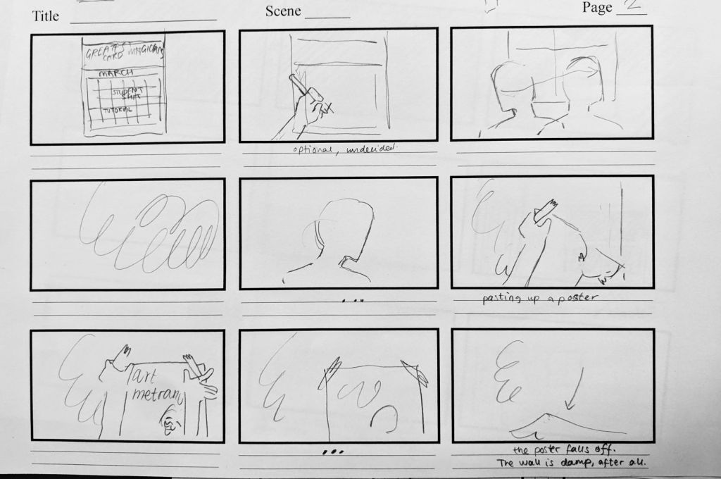
[taking a look at different way closed works can give pleasure, find a comic book or something]

“Their [the pioneers of abstract art] goal, which is characteristic of early Modernism, is to elevate the function of the medium itself to a means of transcending the immediately visible, not through subject matter (as in the case of religious iconography, for instance, but by challenging the limits of logic and of experience through new forms of signifying.” (5)

Visual Diary – Gammes et Arpeges

The hardest part with the new sketchbook, so nicely bound, is filling up these first few pages! I went straight on with ink to chill myself out.

I’ve been thinking about Ludwig getting earrings recently. After I drew him with his hair coming past his ears a couple of times and people mistook it for yellow earrings, the thought got into my head. I wondered who he’d go to get them pierced with and I think it could be really interesting if it was with Mitzi.

Gold and sun themes and yellow really suit him. I collaged a couple of yellow earrings to riff on the theme.

This spread was going to be about Drake and Antonia, still based on the French Scales and Arpeggios, but I found an endearing reference of two people at a piano. I used ink to do some tiny blind drawings, and then some mini studies, and then put the reference away and used the shapes stored in my hand to recreate them with character.

You’ve got this lovely old man, eyes closed, looking up at the young man – clearly knows what he’s doing, piano is an old game. The young man is concentrating, he’s got smoother, more polished and shiny shapes. The old man has lines and life in his face.

You can see the first versions of the young man had a lot of smugness in them, but I wanted the scene to be sweet.

Also, we like a little song about practice and seeing improvement. I need it for my creative practice right now.

Later edit!

Design a site like this with WordPress.com
Get started